Case study · Product & UI design

More Than a Thermostat

Redesigning the Google Nest Thermostat: making energy visible, comfort personal, and sustainability truly affordable.
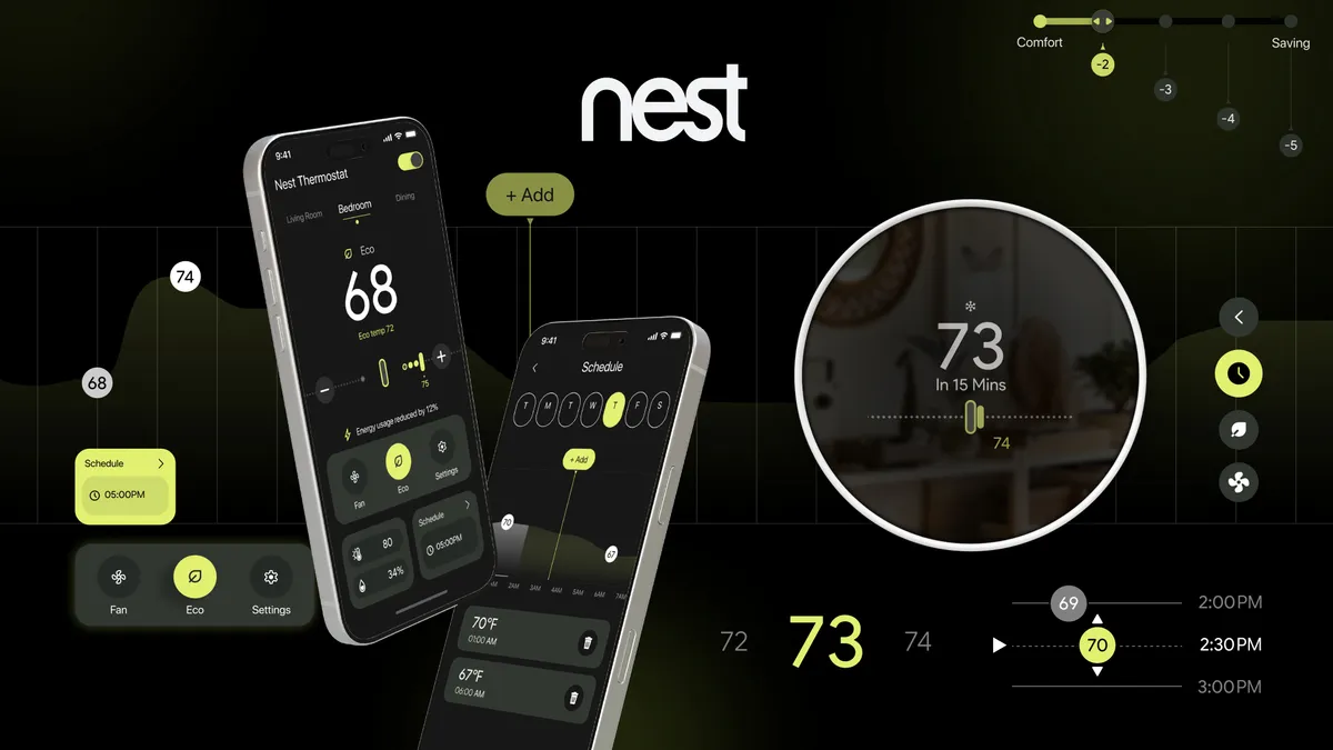
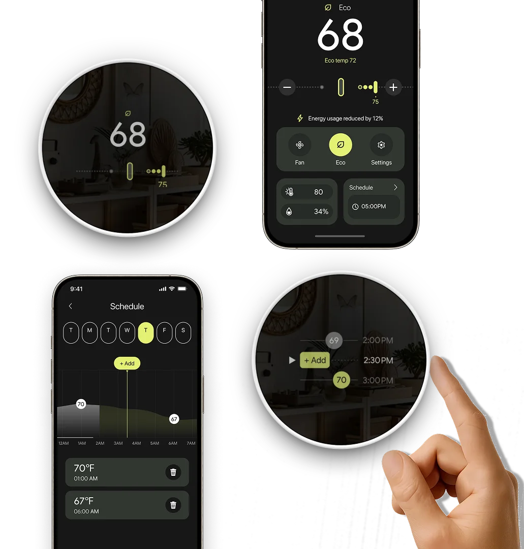
The redesigned Nest app on two phones beside the round thermostat display showing 73 degrees, with lime-green accents on black.
Team
Navyaa Taneja, Jinxue Yang, Siqing Zhong, Peter Yao
Role
Project Manager, Presenter, UX Design, Usability Testing

Not more automation. Just a smarter design.

Recognition

Awards

  • Red Dot Design Concept Award 2026
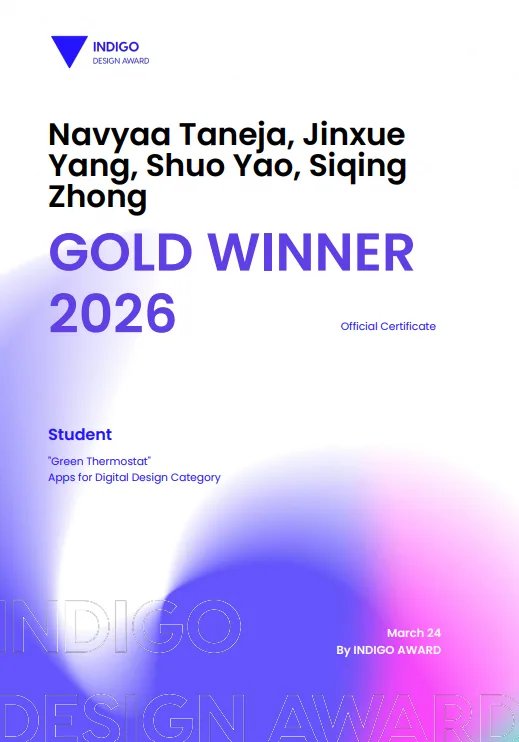
  • Gold Winner, Apps for Digital Design (Indigo Design Awards)
  • Silver Winner, Branding for Graphic Design (Indigo Design Awards)
  • Silver Winner, UX, Interface & Navigation for Digital Design (Indigo Design Awards)
  • Silver Winner, Interaction Design for Graphic Design (Indigo Design Awards)
  • Silver Winner, Digital Design for Graphic Design (Indigo Design Awards)
  • Bronze Winner, Interactive Design for Digital Design (Indigo Design Awards)
  • Honorable Mention, International Design Awards (IDA) 2025
Red Dot winner 2026 logo. Indigo Design Award Gold Winner 2026 certificate for Navyaa Taneja, Jinxue Yang, Shuo Yao and Siqing Zhong. International Design Awards (IDA) certificate for the Google Nest Thermostat redesign.

The Challenge

Green and Affordable: smarter temperatures, smaller footprints.

Our challenge was to redesign the Google Nest Thermostat and companion app to make sustainable temperature control more green and affordable. The goal was to go beyond surface-level aesthetics and explore how front-end design and design systems could empower users to balance comfort with savings, encourage eco-friendly behavior, and create an interface that feels both intuitive and accessible.
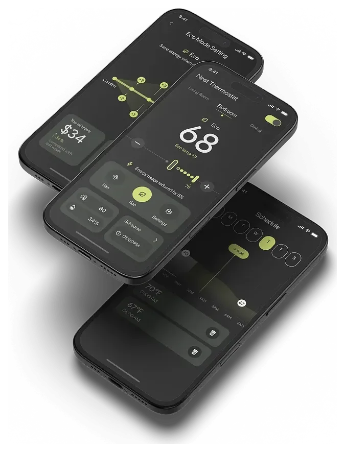
Two phones floating at an angle, showing the redesigned Nest app home screen at 68 degrees with eco mode on.

Goal

Do we stay comfortable or save money?

Most smart thermostats make you pick a side: comfort or cost.
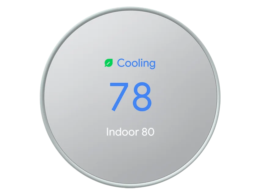
The current Google Nest Thermostat: a round silver dial reading Cooling, 78, Indoor 80.

Design Principles

  1. 01

    Intuitive Functionality

    Designed around real behavior, scrollable, and clearly guided across both device and app.

    Delivered by One system

  2. 02

    Easy Scheduling

    A simplified, visual timeline that replaces taps and guesswork with intuitive gestures.

    Delivered by Timeline

  3. 03

    Emotional Clarity

    Supportive interactions and humanized UX writing that reduce hesitation and build confidence.

    Delivered by Energy feedback

  4. 04

    Eco Awareness by Default

    Subtle nudges, visual feedback, and default behaviors that promote greener living.

    Delivered by Eco range

  5. 05

    Affordable Without Compromise

    A clean, confident UI that feels accessible, never cheap.

    Delivered by Savings slider

How Might We…

Make energy-saving experiences more visible, more intuitive, and more trustworthy, without compromising comfort or affordability?
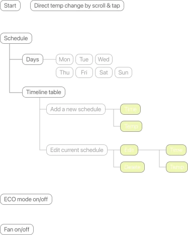
Information Architecture

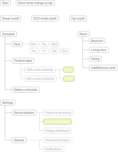
Thermostat information architecture: from the start screen, users change temperature directly by scrolling and tapping, open schedules with a timeline table, add or edit schedules, toggle eco mode, and turn the fan on or off.
Thermostat
App information architecture: from the start screen, users change temperature by tapping, toggle power, manage schedules on a timeline, adjust eco mode settings, and open settings.
App

Moodboard, Wireframing & Ideation

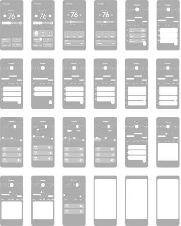
We started from a moodboard of calm, dark interfaces with a single bright accent, then iterated through dozens of low-fidelity screens for both the app and the round display.
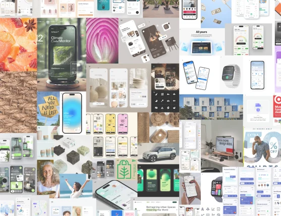
Moodboard collage of dark smart-home interfaces, devices, lifestyle photos and nature textures.
Moodboard
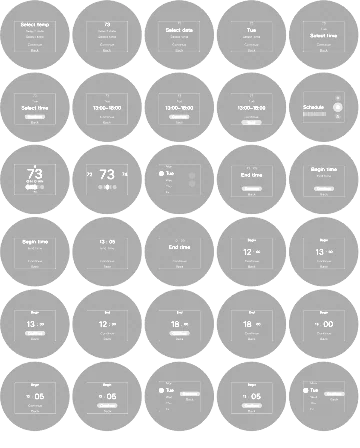
Grid of 24 low-fidelity mobile wireframes iterating on home temperature control and scheduling.
App wireframes
Grid of 30 low-fidelity circular wireframes for the thermostat display, exploring step-by-step flows.
Thermostat display wireframes

Validation

Usability Testing

We tested two design versions with 15 participants, who completed tasks like changing temperatures and scheduling. Through observations, timing, and SUS surveys, we identified pain points and validated that the redesigned interface was more intuitive, efficient, and eco-friendly.
  • 15participants
  • 2design versions compared
  • SUSsurveys, task timing and observation

Style Guide

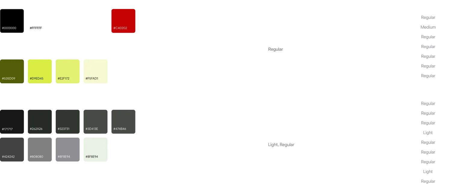
Style guide. Primary colours black and white; error red #C40202; accent greens #535D09, #D9ED45, #E2F172 and #F5FAD1; a grey scale; and the type scale.

Components

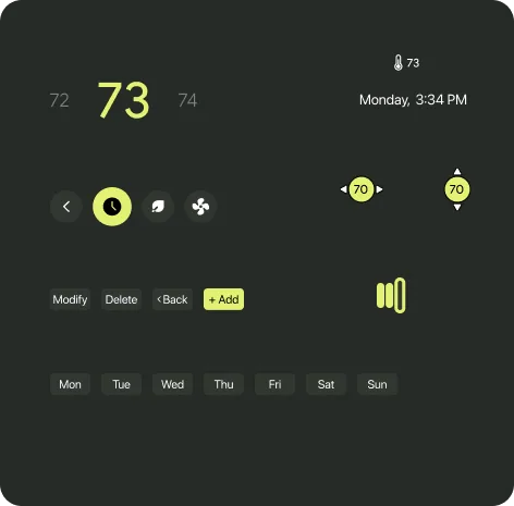
Thermostat UI components: a temperature scroller with 73 highlighted, a status readout, eco and fan icons, and day-of-week chips.
Thermostat components
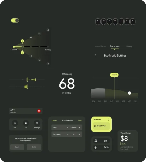
App UI components: a toggle, an eco mode comfort-to-saving slider, day selector chips, room tabs, a cooling status card, a schedule timeline, a delete dialog, and an energy savings card.
App components

Outcome

What We Built

The redesigned thermostat blends comfort, clarity, and sustainability, offering intuitive controls and real-time eco feedback that make energy-conscious living effortless and affordable.

  • Swipe down

  • Swipe up

  • Tap

What We Introduced

  1. 1Eco range indicator
  2. 2Scheduling timeline
  3. 3One system
  4. 4Comfort–savings slider
  5. 5Energy feedback

Smart progress bar

Eco Range Indicator

The green dots show the active Eco temperature range. Each dot represents a point where the thermostat will operate to reach your set temperature. Blank segments indicate temperatures the system will skip to save energy.

Here, the system won’t cool below 72°F. The current temperature is 75°F, so it will only cool until it reaches the green zone, minimizing energy use.
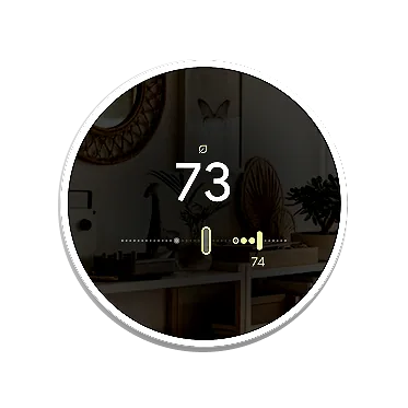
The round thermostat display in a living room at 73 degrees, with green dots marking the active eco range on the slider.

See it, set it

Dynamic-Scheduling Timeline

Visual scheduling with simple touch control. Drag along the day to add or move a temperature point, on the phone or right on the device.
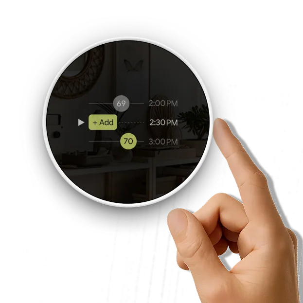
A finger touching the round thermostat display, which shows a schedule timeline with times and an Add button.

Intuitive Functionality

A unified experience across app and device, with thumb-friendly and intuitive gestures.
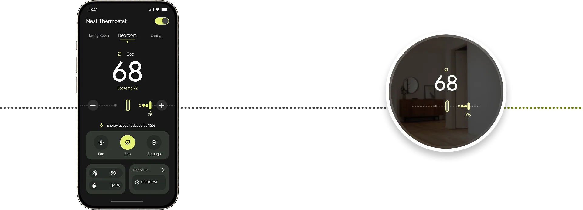
The Nest app home screen at 68 degrees, joined by a dotted line to the thermostat display showing the same 68 degrees. One system, one experience
A hand reaching toward the round thermostat display, alongside the Nest app home and schedule screens.
  1. Same controls on both screens

    The temperature and eco slider look and behave the same on the phone and on the wall.

  2. Thumb-friendly

    Large targets and simple swipes, so it works one-handed.

  3. Schedule from either

    Set a time on the dial, or drag along the timeline in the app.

Eco Mode

Before

  • Eco Mode auto-activates only when no one’s home.
  • Manual activation needs the Google Home app.
  • Eco temperature ranges are fixed.

After

  • Eco Mode works even when users are home.
  • Quick, in-app control with a single tap.
  • Eco Mode adapts based on user-defined comfort zones, balancing energy savings with usability.

Comfort-Savings Slider

Customizable comfort, with instant visual feedback. Adjust the comfort zone, and see the savings unfold.
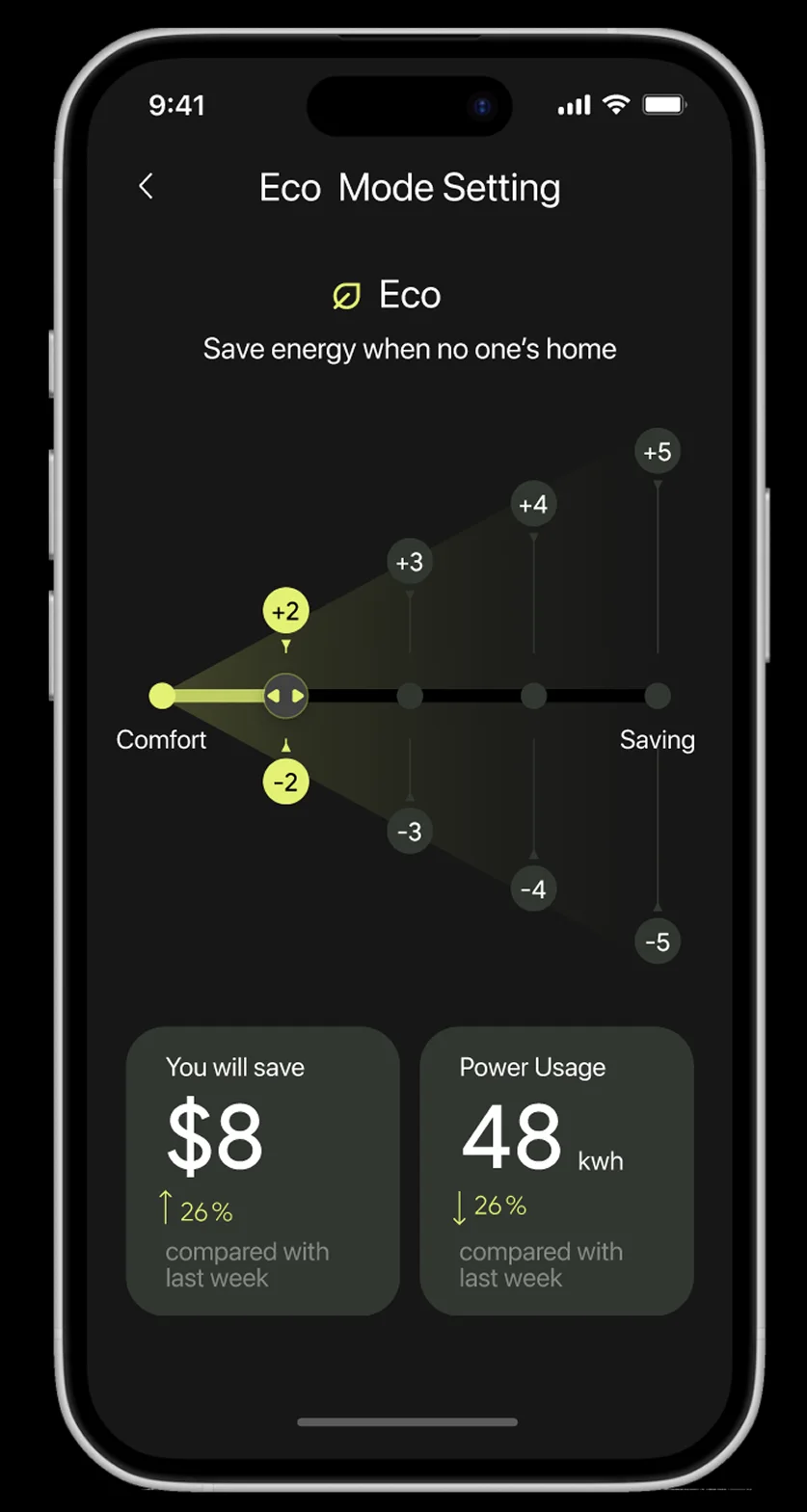
Eco Mode Setting screen showing $8 saved and 48 kWh power usage compared with last week.

Real-Time Energy Feedback

Users see how their settings impact savings week by week.