Before
No visible skip
The fit quiz felt mandatory.

Case study · Inclusive e-commerce
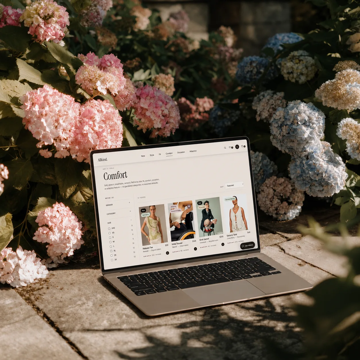
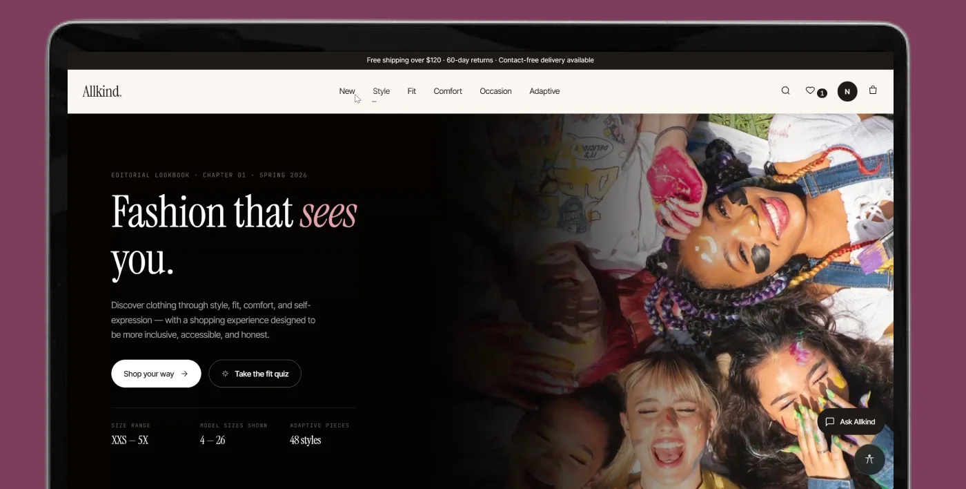
Fashion that sees you. An online shopping experience designed around fit, comfort, accessibility, representation and trust, not gendered categories.
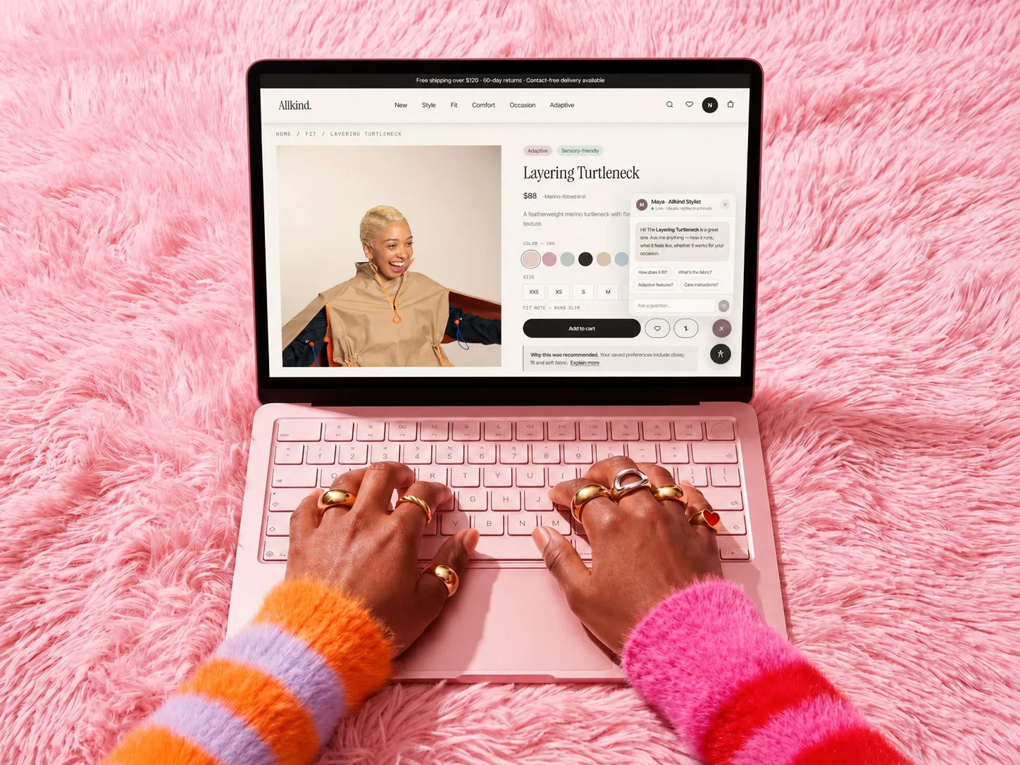
Try the live prototype (opens in a new tab)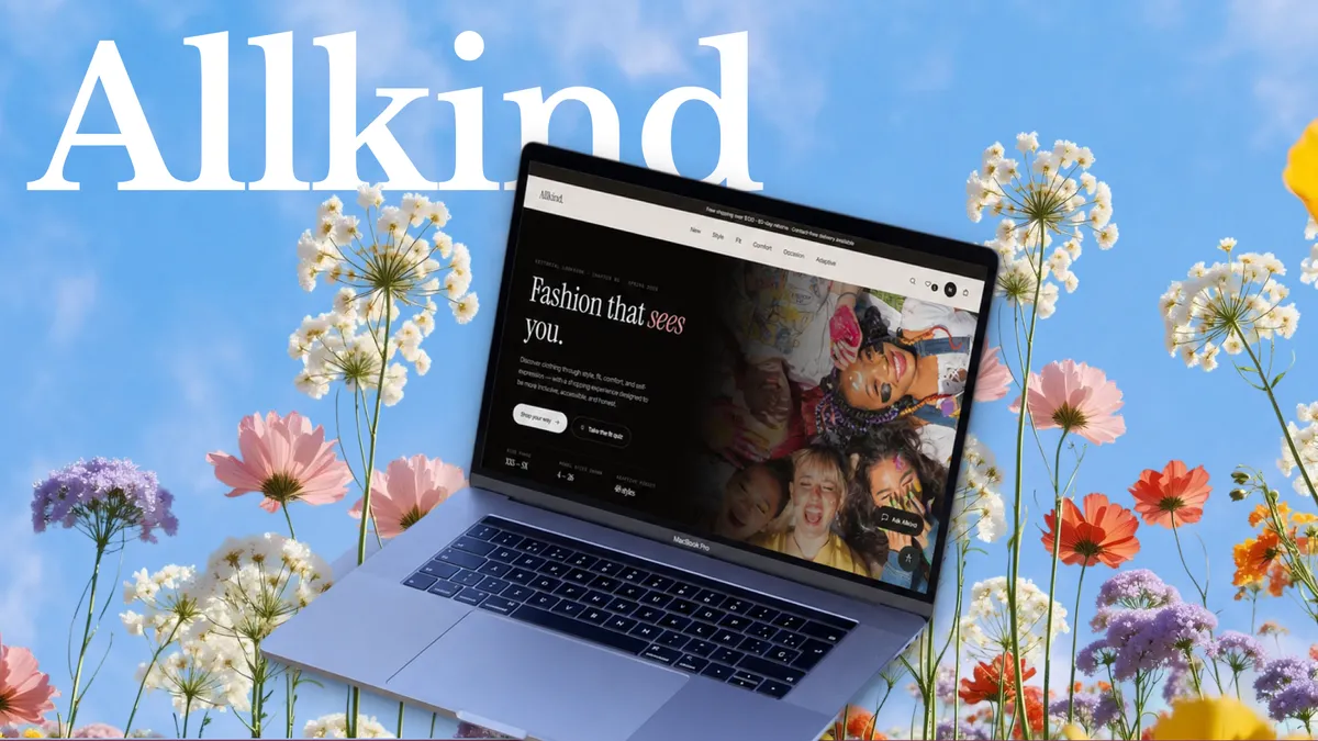
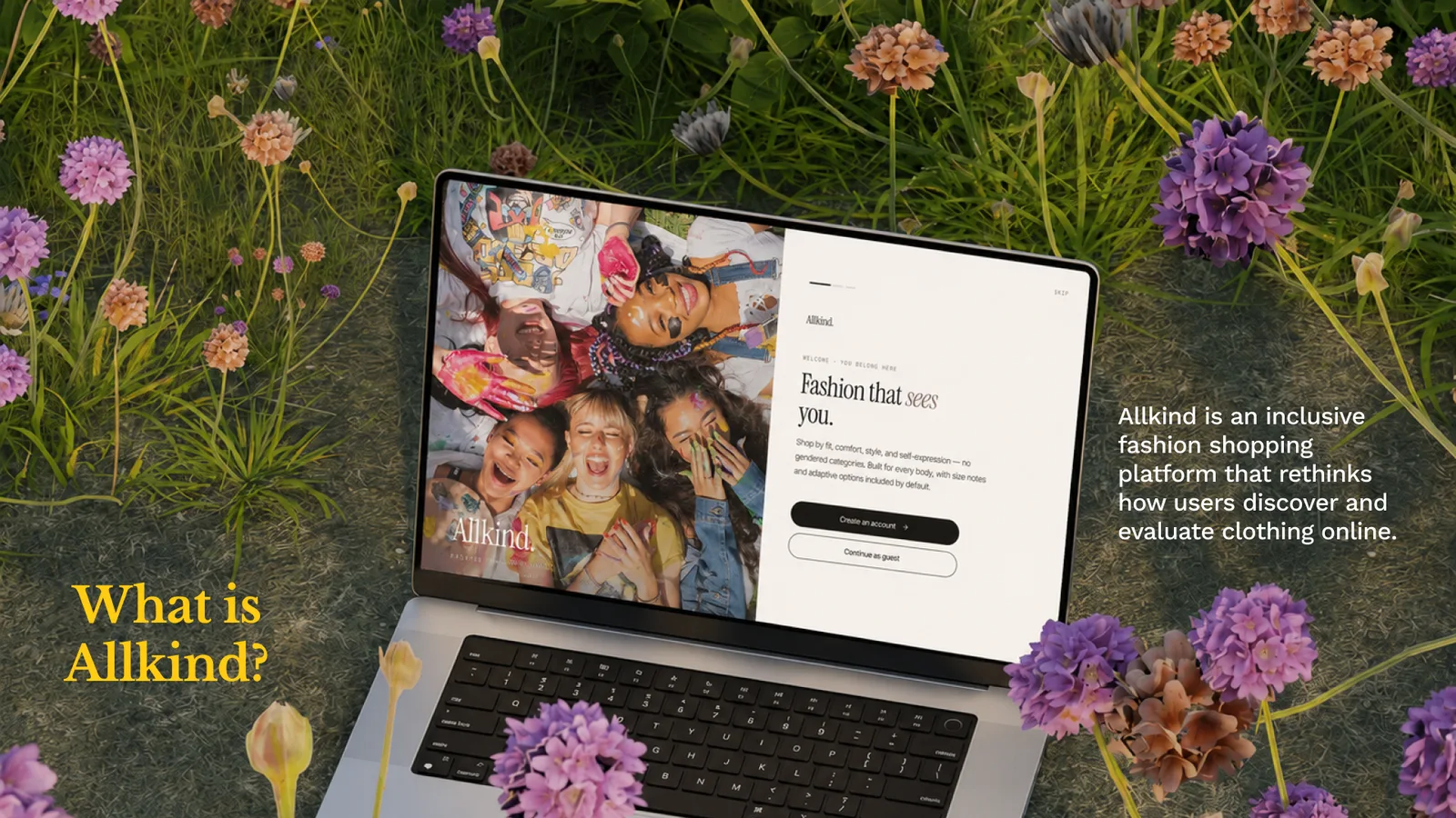
Allkind is an inclusive fashion shopping platform that rethinks how users discover and evaluate clothing online.
The Problem
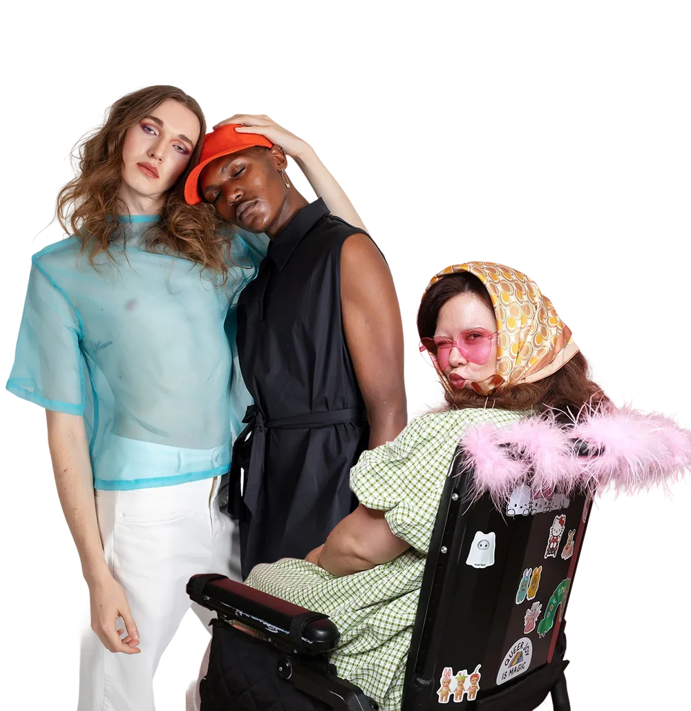
Online fashion shopping often excludes users through narrow categories, weak fit guidance, inaccessible experiences, and low trust in product visuals. Users are asked to make high-uncertainty decisions with low support.
Who this is for
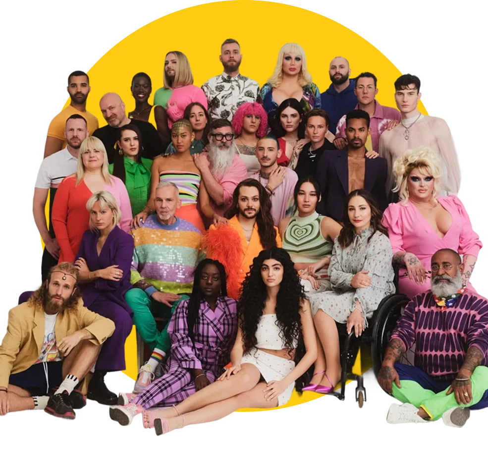
General online shoppers, who benefit from clearer guidance, better comparison, and more honest product information.
Opportunity
Create a shopping experience that helps users browse more naturally, understand products more clearly, and make decisions with more confidence.
Core design principle
This shaped my interaction decisions in three ways:
Onboarding, a fit quiz and navigation by intent, not identity.
Flows 1–2 →A layered product page, plus saving and comparing.
Flows 3–4 →An assistant that explains itself and a transparent dashboard.
Flow 5 & dashboard →Prototype overview
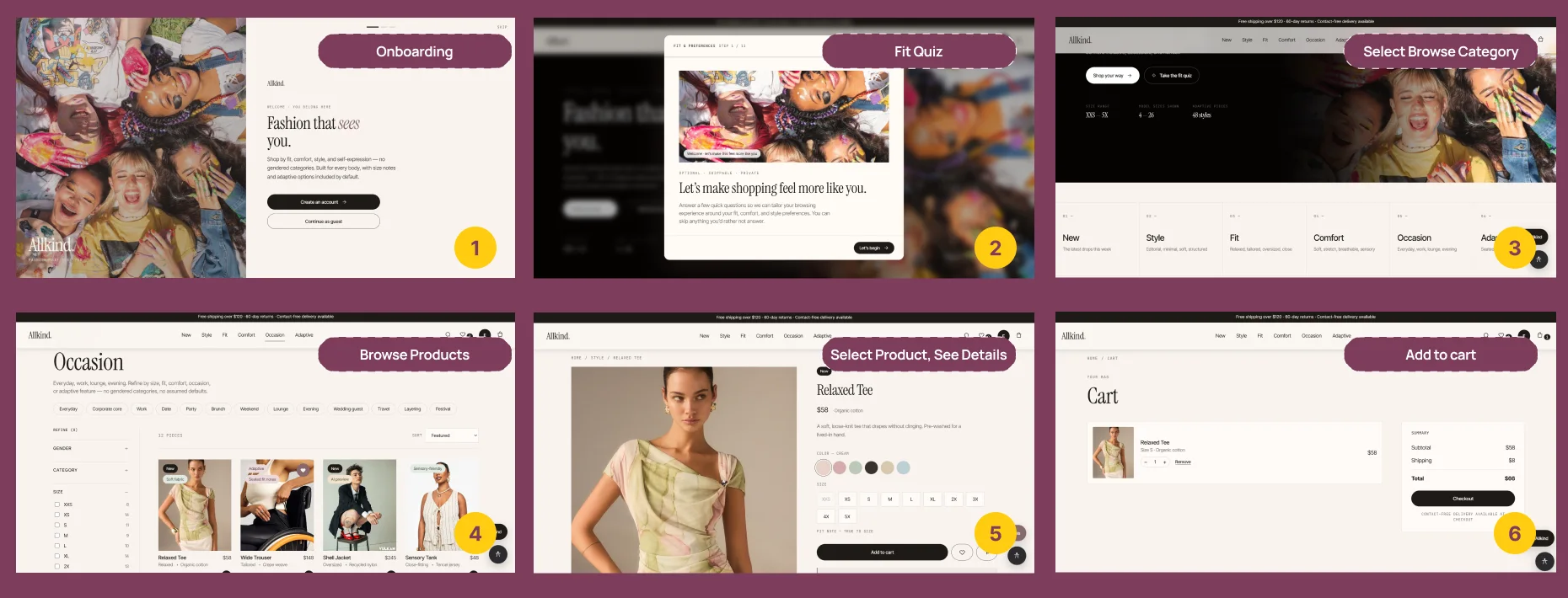
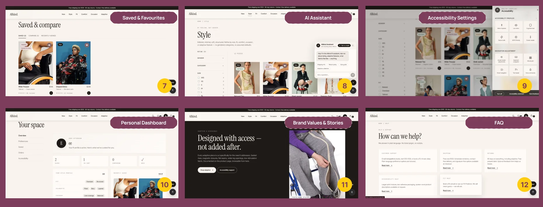
The prototype covers the main moments where users need support, guidance, and reassurance while shopping online: onboarding, the fit quiz, choosing a browse category, browsing, product details, and adding to cart. Supporting flows cover saved items, the AI assistant, accessibility settings, a personal dashboard, brand stories, and FAQ.
Jump to a flow
Flow 1
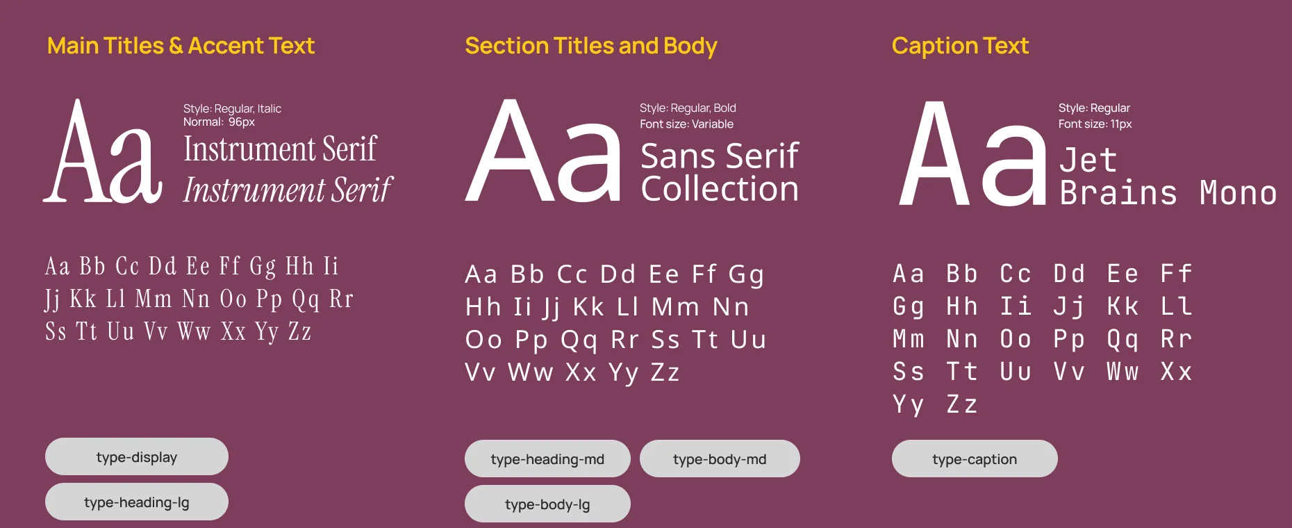
Dark pattern avoided
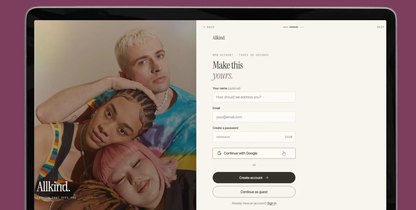
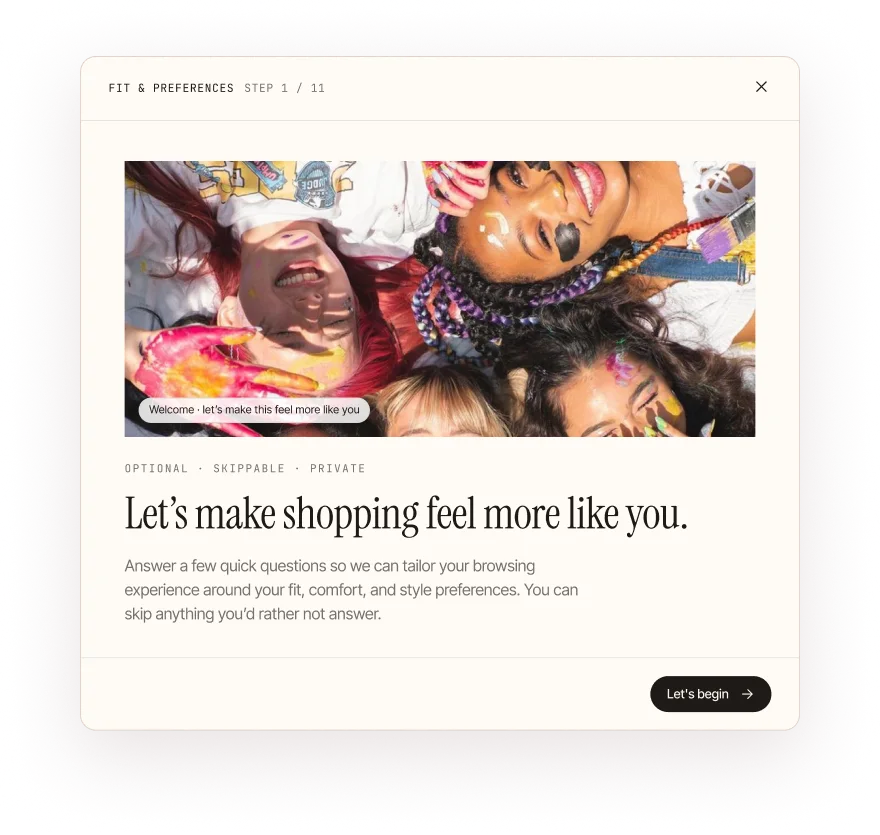
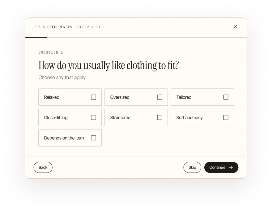
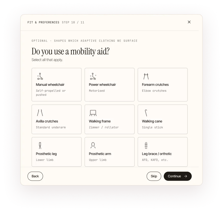
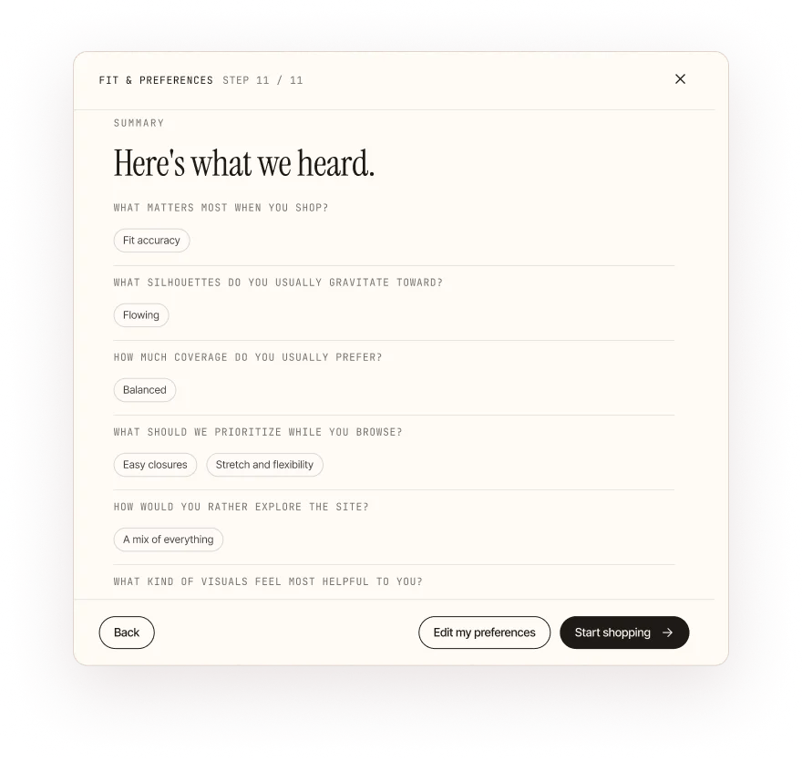
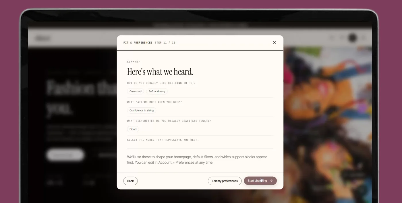
It personalizes without forcing identity-based categorization, and reduces the burden of starting from a blank experience. It can be skipped; the option to skip was added after the first round of testing.
Personalization helps build trust, but it should always be an optional layer. When it’s mandatory, it makes users uncomfortable.
Flow 2
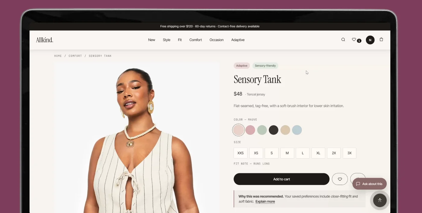
I organized the primary navigation around shopping intent rather than identity categories, using a hierarchical navigation model with faceted browsing. Gender categories still exist, inside the filters.
Dark patterns avoided
It’s important to balance innovation with users’ current mental models. Adding gender to the filters came directly out of user testing.
Flow 3
Dark pattern avoided
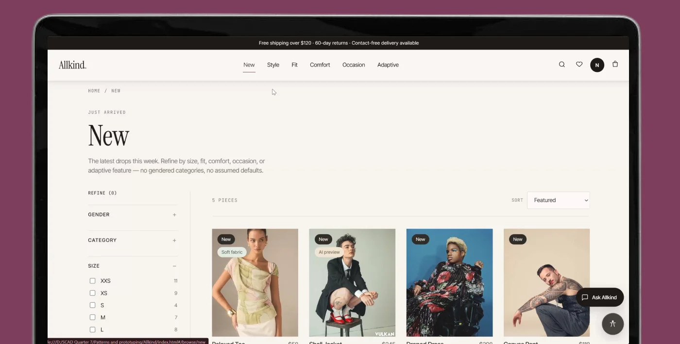
People love detail, but only when they choose to access it. Information shouldn’t be forced on them; they should have the freedom to open it.
Flow 4
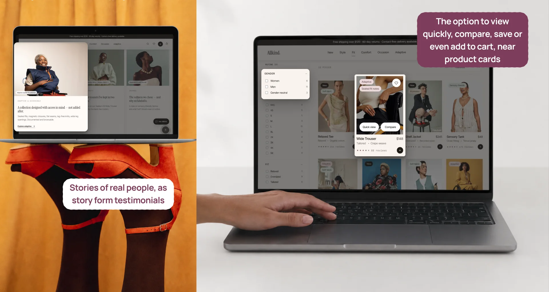
Fashion shopping often involves hesitation and revisiting. Saving lowers the pressure and supports reflection, with instant icon feedback and confirmation. Compare helps users externalize a mentally difficult task, instead of switching between tabs or relying on memory.
Dark patterns avoided
Flow 5
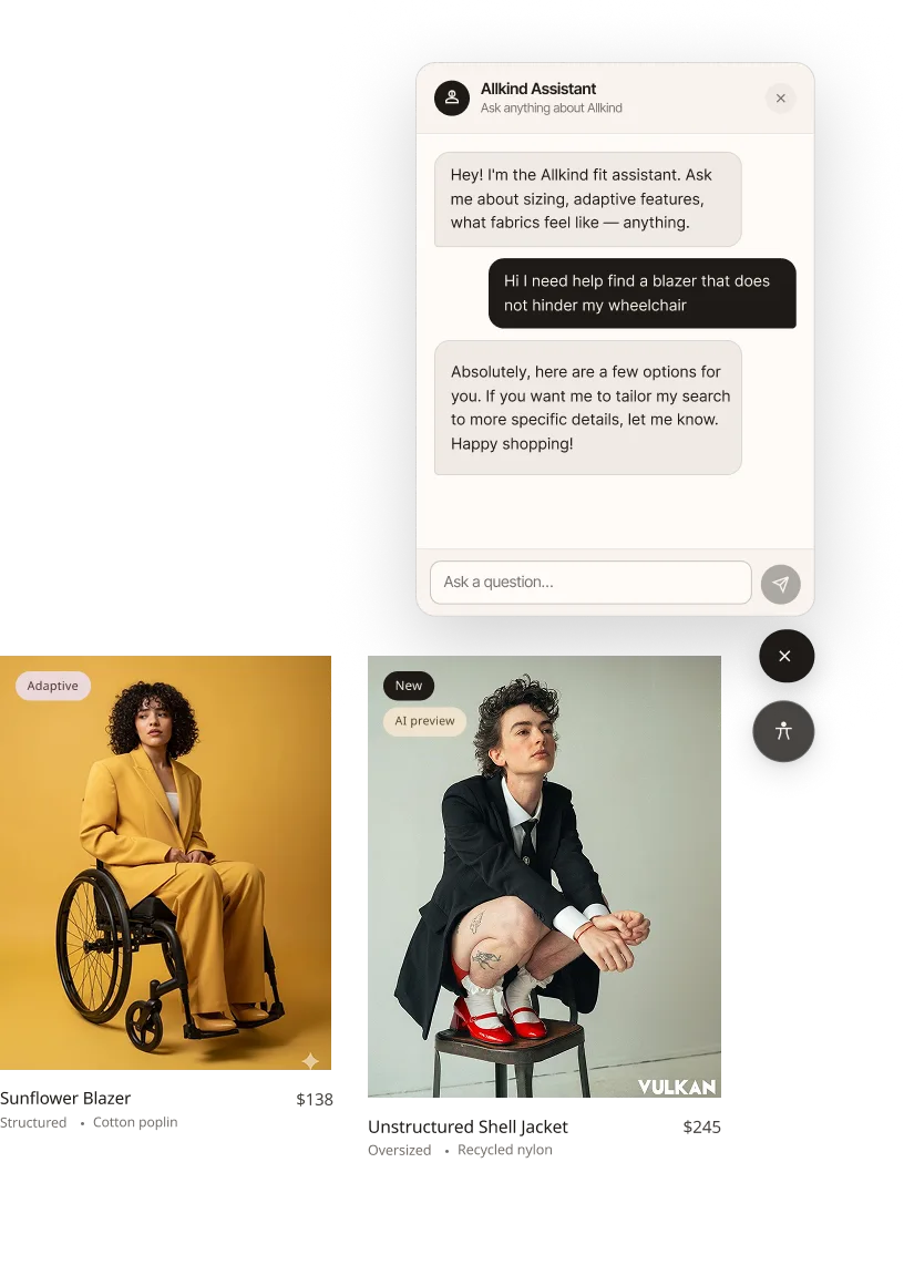
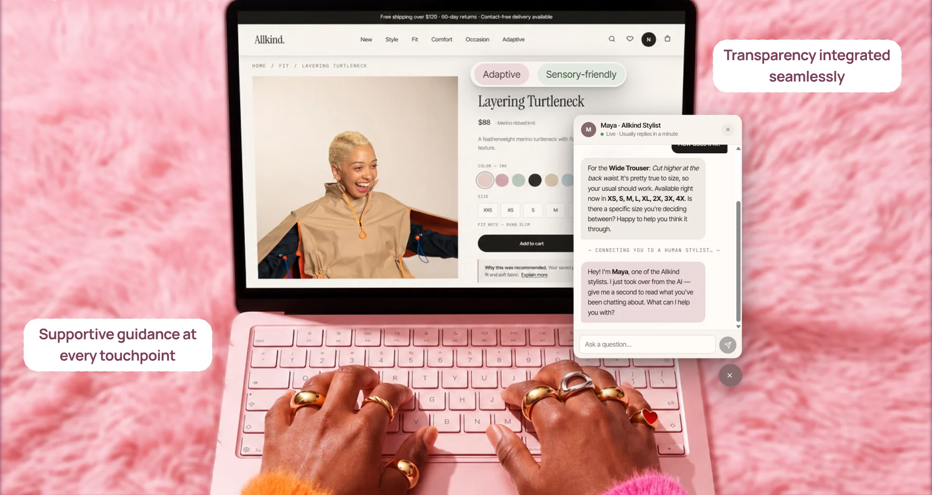
I split AI into two systems: a personalization layer that helps before users ask, and an AI assistant that helps when they become uncertain. It assists at high-uncertainty moments without replacing browsing, explains its recommendations, and falls back gracefully when its confidence is low.
Dark patterns avoided
Reads: user questions, the current product page, saved preferences, product metadata, reviews and fit notes.
Returns: answers, fit and comfort summaries, comparison help, clarifying questions, recommendation explanations, and fallback guidance when unsure.
Reads: fit quiz answers, comfort, browsing and accessibility preferences, saved items, browsing history, and clicked categories.
Returns: a tailored homepage, preference-based suggestions, and the reasoning behind each recommendation.
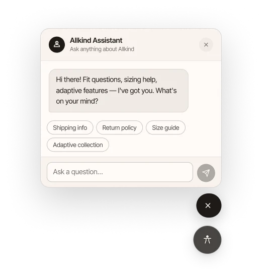
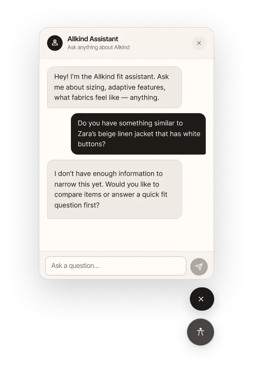
If either system lacks enough information, the personalization layer gives broader recommendations, and the assistant asks follow-up questions or offers other paths, including talking to a human stylist.
AI helps with personalization and recommendations, but some users still need human assistance. That’s why I added a human stylist layer to the AI assistant.
Transparency
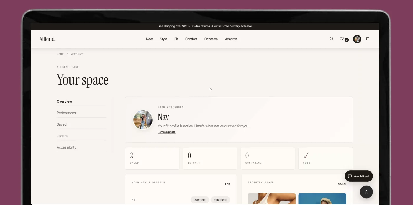
Inside the profile, a dashboard summarizes the preferences chosen in the fit quiz: fit, silhouette, coverage, browsing priorities, and recently saved products. Instead of the system quietly adapting in the background, users can see what’s shaping their recommendations, and come back to review or change it whenever they want.
Dark patterns avoided
Pattern inventory
| Pattern | Where it appears | Why it was used |
|---|---|---|
| Hierarchical navigation + faceted browsing | Homepage, browse | Supports broad entry and flexible refinement |
| Multi-step onboarding (wizard) | Fit quiz | Personalizes gradually without overwhelming users |
| Progressive disclosure | Product page, AI support | Lets users access detail only when needed |
| Cards | Homepage, browse, dashboard | Supports scanning and comparison |
| Save + compare | Product cards, compare flow | Reduces pressure and supports reflective decisions |
| Conversational UI | AI assistant | Enables direct, contextual help |
| Dashboard / profile summary | Profile | Makes personalization visible and editable |
| Accessibility settings panel | Accessibility section | Keeps support controls visible and user-led |
Design system v3
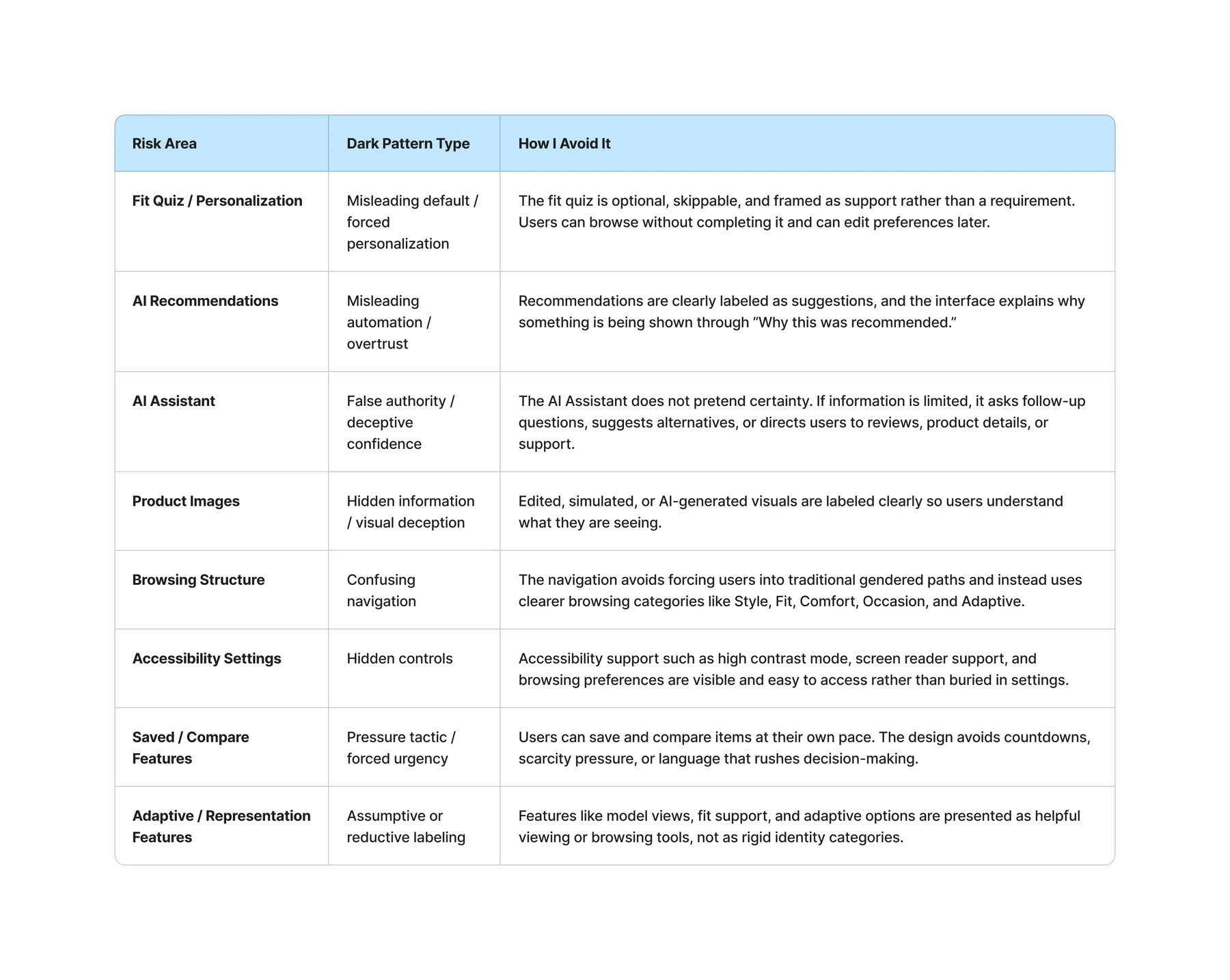
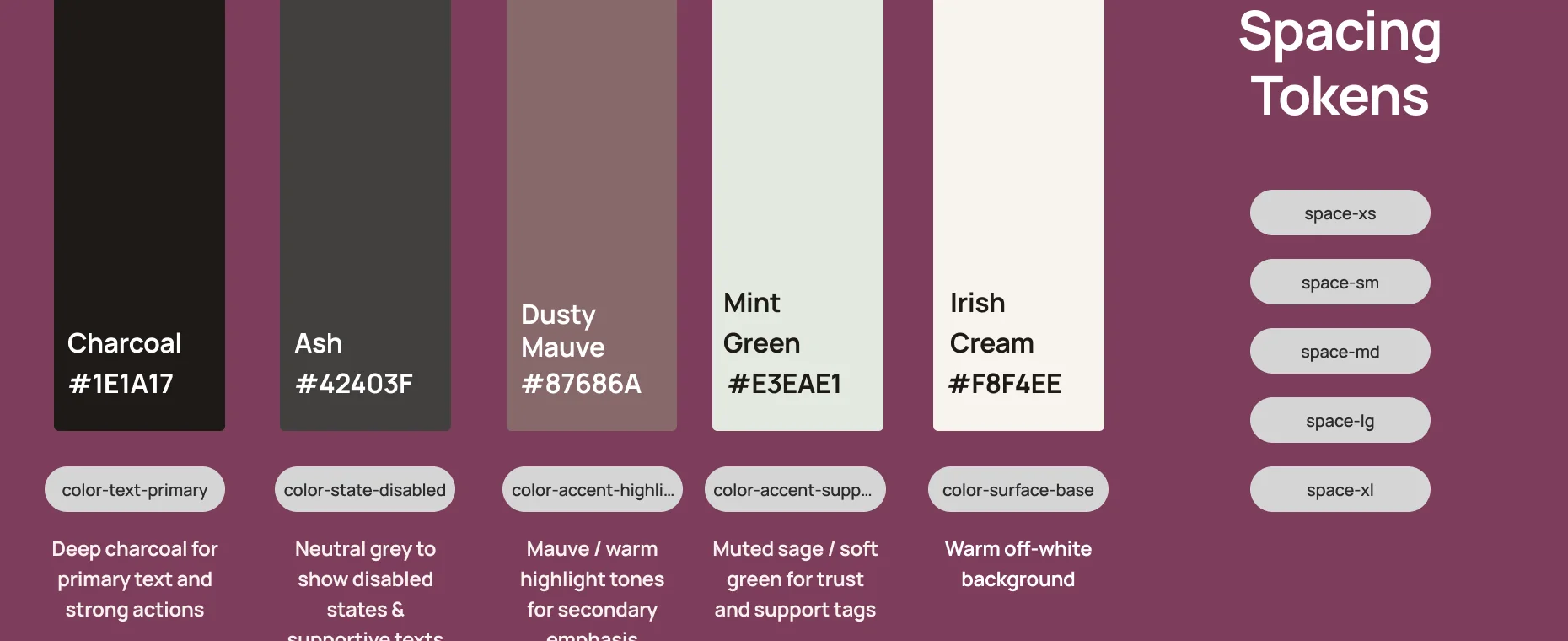
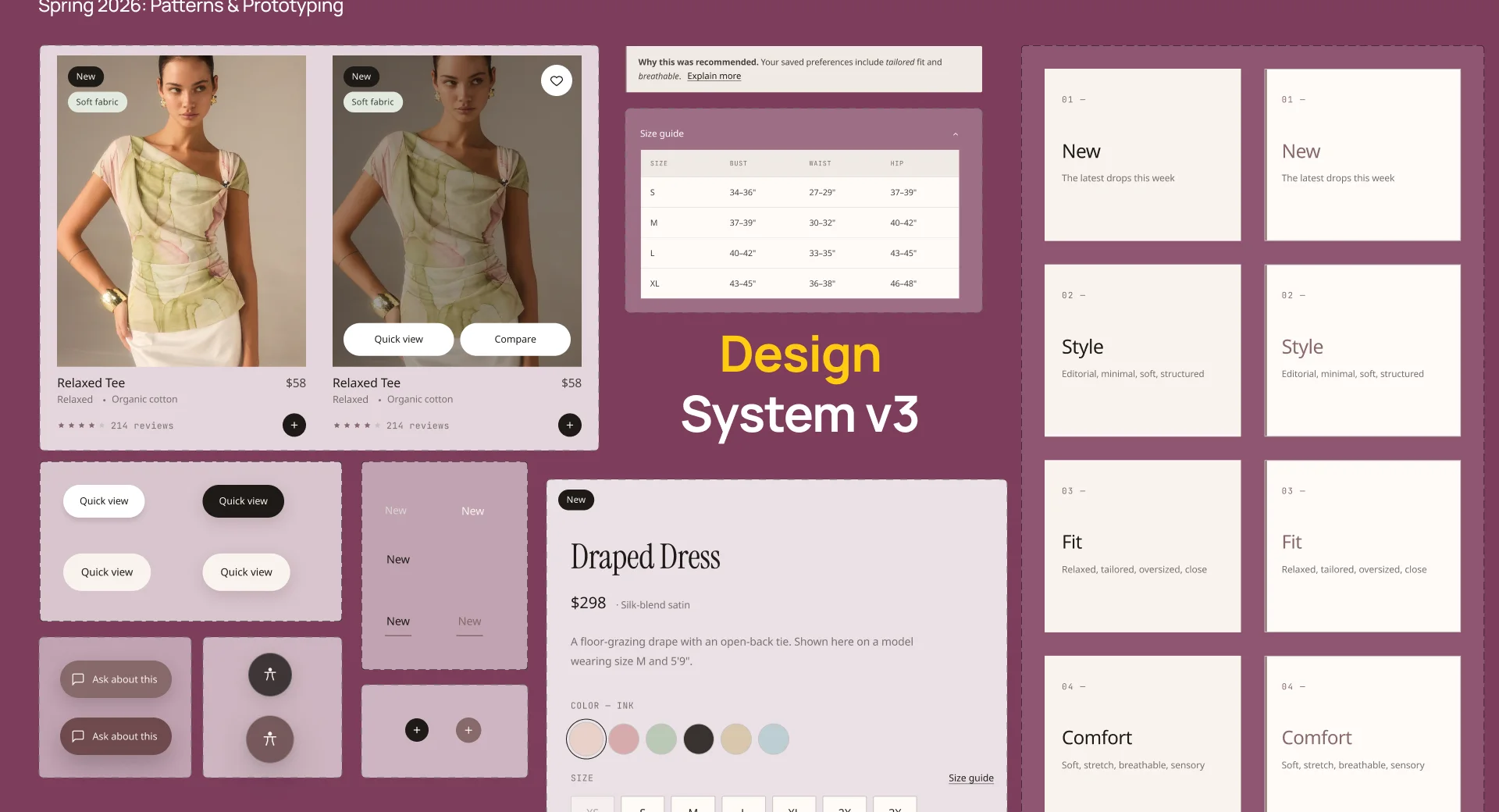
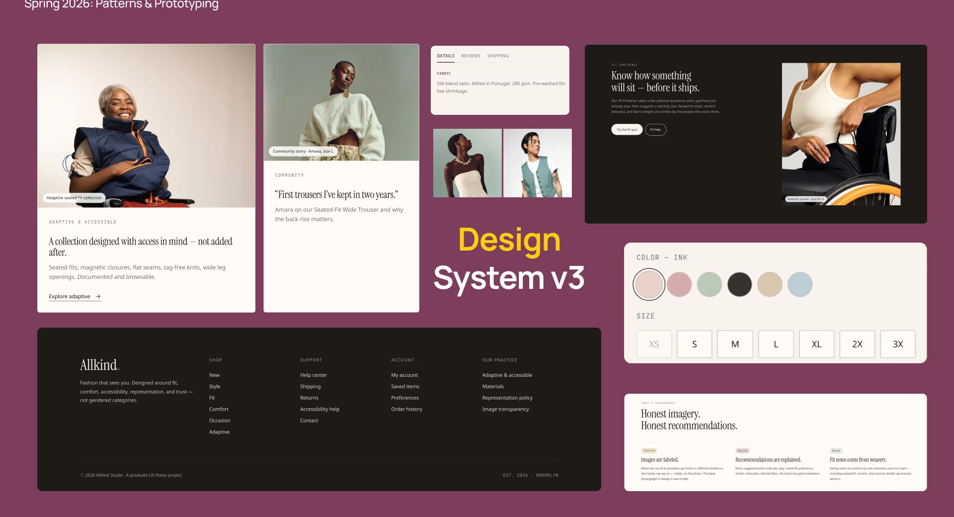
Instrument Serif for titles and accents, a sans-serif collection for headings and body, and JetBrains Mono for captions. The palette pairs deep charcoal with dusty mauve, a muted sage for trust and support tags, and a warm off-white background.
Accessibility
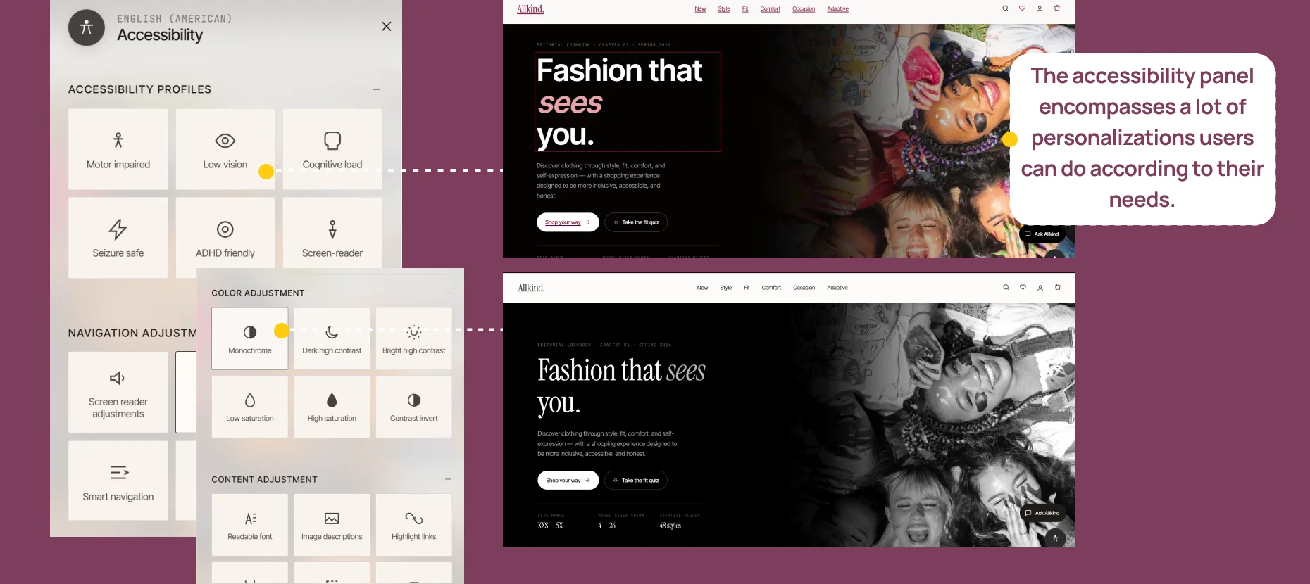
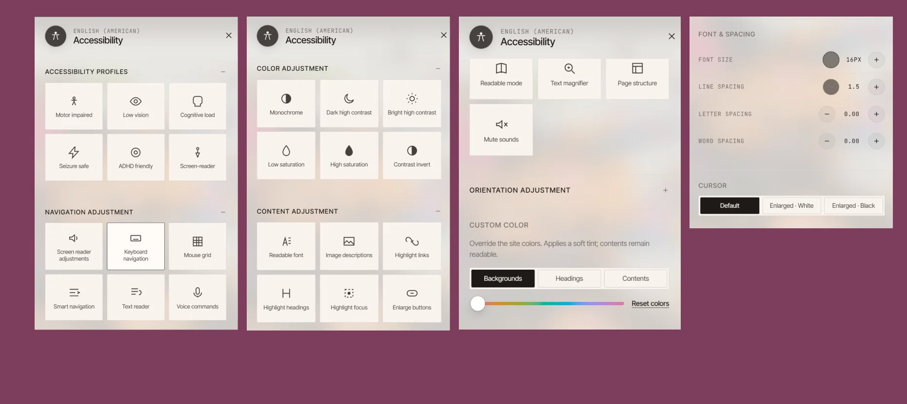
The accessibility panel brings together the personalizations users can make for their own needs: accessibility profiles, navigation adjustments, colour and contrast, and content adjustments.
Usability testing
Moderated usability testing through guided walkthroughs, with participants thinking aloud while they completed the onboarding and fit quiz, browsed with navigation and filters, and used the AI assistant to understand a recommendation.
Before
The fit quiz felt mandatory.
After
Personalization became an optional layer.
Before
Users couldn’t see what personalization changed.
After
A profile dashboard shows what shapes recommendations.
 (opens in a new tab)
In conclusion
Allkind rethinks online fashion shopping around the moments where users feel the most uncertainty: how to begin, how to interpret products, how to trust what they are seeing, and how to decide with confidence.