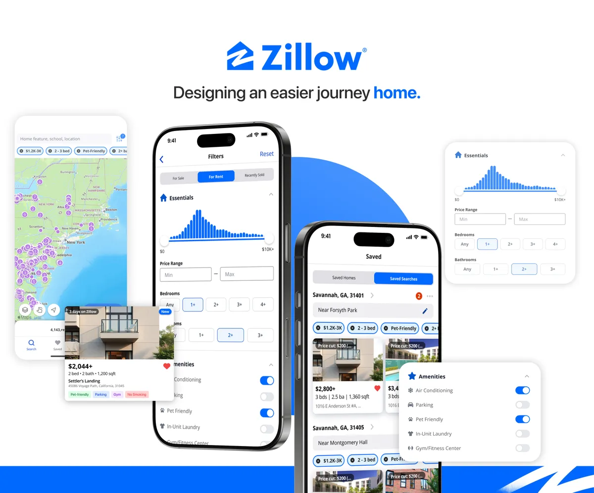

Zillow Redesign: Simplifying the Search for Home
Overview
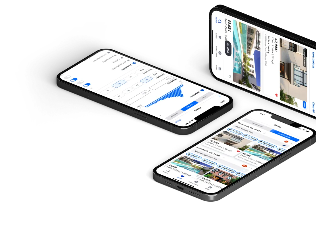
A usability-focused redesign of Zillow’s mobile app to simplify search, filtering, and saved listings for renters making critical housing decisions.
 Aarushi PohnerkarProduct Owner
 Jordan McMorrisSCRUM Manager
 Keerthi GinugaUX Design Lead
 Navyaa TanejaUX Research Lead
 Qi LuoData Analyst
 Hazel DoVisual Design Lead
The story behind the study
What happens when your dream home is just one click away… but you can’t figure out how to get there?

Meet Ava.
A SCAD student moving to Savannah, opening Zillow to find her first rental. She wants a place that is:
- Affordable
- Walkable
- Practical
Excited, Ava opens Zillow. However…
-
“It’s hard to draw…”

She can’t figure out the draw tool.
-
“Why are there 52 filters…?”

The filters are either confusing or missing.
-
“Where are the filters I saved??”
Her saved searches seem to disappear.
Just when Ava’s rental journey hit its most frustrating point, our team stepped in to rewrite her Zillow experience.
Our Goal
To uncover usability issues with Zillow’s in-app rental experience and explore design solutions that help users search smarter, save confidently, and navigate with ease.
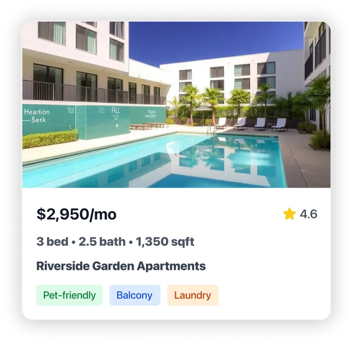
Why Zillow?

Market Leader
The platform most renters reach for first.

Familiar Yet Frustrating
Everyone knows it, and many struggle with it.

High-Stakes Use Case
Finding a home is a big, stressful decision.

Improvement Potential
Clear, fixable gaps in search and saving.
Key Objectives
- Evaluate if users can search intuitively
- Assess filter clarity and trust
- Analyze saved search & saved home flow
- Uncover unmet user needs for first-time movers
We aimed to achieve…
- Clarity
- Structure
- Simplicity
What We Thought We Knew
Four assumptions going in. Testing would prove every one of them wrong.
- Users could easily find core features.
- Filter design was clear and logically sound.
- Navigation tabs were intuitive for users.
- Zillow’s save feature met user needs.
Insights from Secondary Research

Confusing Architecture
The same functions are presented in different ways, causing confusion.

Disconnected Maps and Lists
The two views are not linked, making operations cumbersome.

Easy-to-Misuse Filters
No undo option, hidden options, and easy to reset.

Abnormal Navigation Logic
The back button does not function as expected, causing workflow disruptions.

Cluttered Interface
Buttons are too densely packed, leading to frequent accidental taps.

Trust Issues
There are disputes regarding fake listings and inaccurate valuations.
Time to turn insights into action. We put it to the test!
How We Recruited

Who We Recruited

What they had in common
Behaviour Mobile-first browsing · Cross-platform searchers · Frequent Zillow users
Needs & frustrations Want fast, clear filters · Expect saved listings to sync · Confused by “Updates” vs “Saved” · Need pet-friendly, budget listings
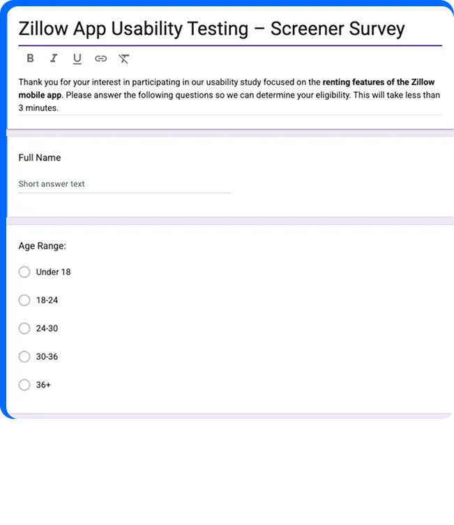
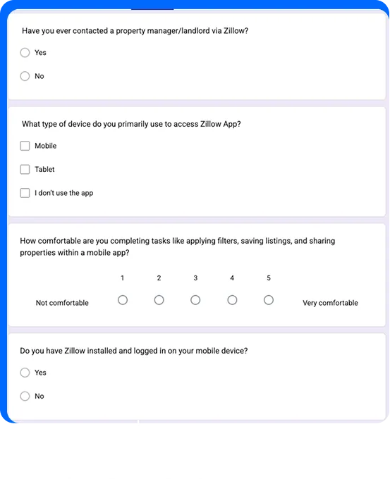
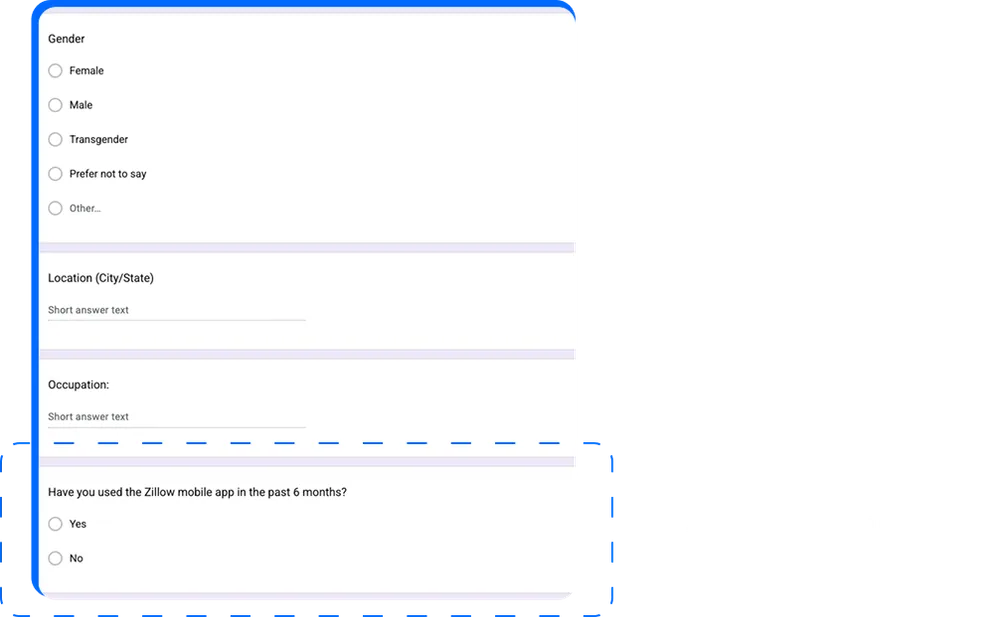
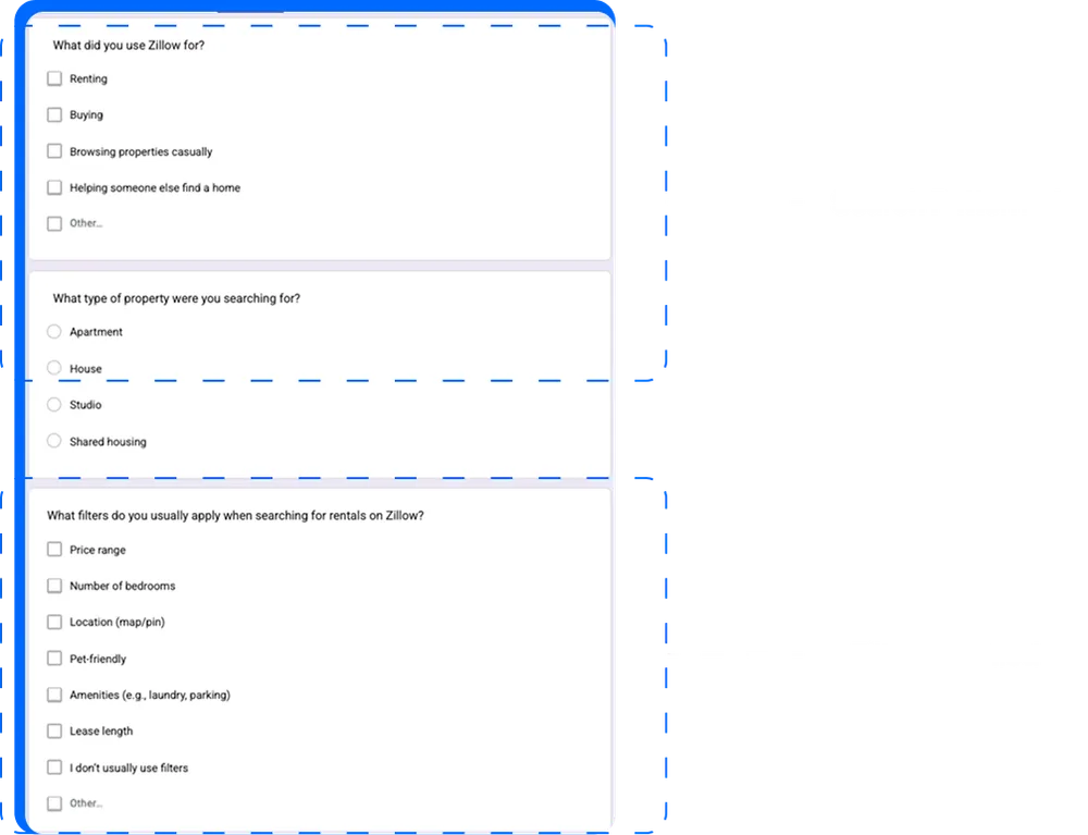
Screener Survey
To make sure testing reflected real rental experiences, a screener survey found participants who matched Zillow’s typical renter profile, making our findings more focused, reliable and actionable.
Methods of Testing
- 01
Tree Testing
Observing users navigate Zillow’s information architecture.
- 02
Usability Testing
Watching users navigate Zillow on real tasks.
- 03
Interviews
One-on-one conversations with each participant.
Tree Testing
Can the app’s structure help people find things quickly? We tested with people who had never used Zillow, to remove any learned navigation habits.
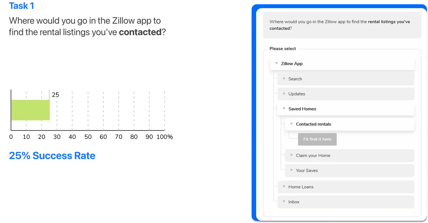
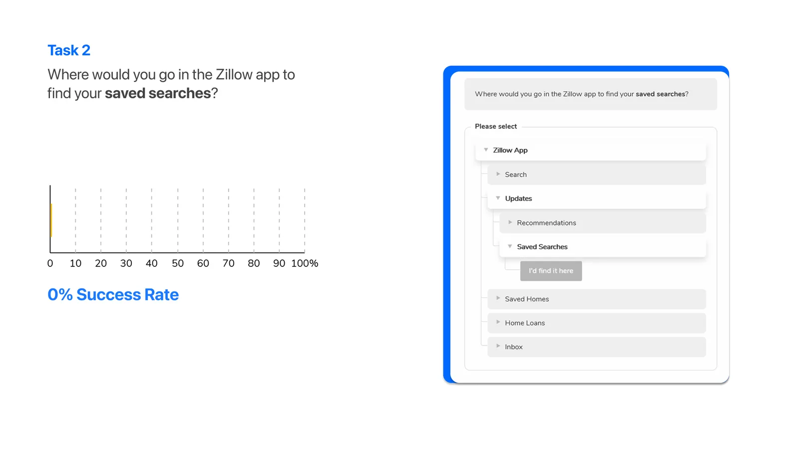
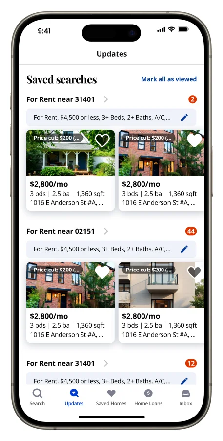
Misinterpreted “Updates”. Many users expected saved content under the wrong tab.
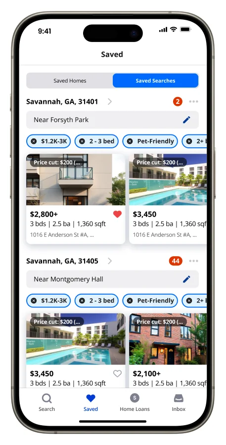
Preferred clearer labels. Participants suggested terms like “Saved Searches” or “Favorites.”
Usability Testing
- 7participants
- 3tasks
- 72%completion rate
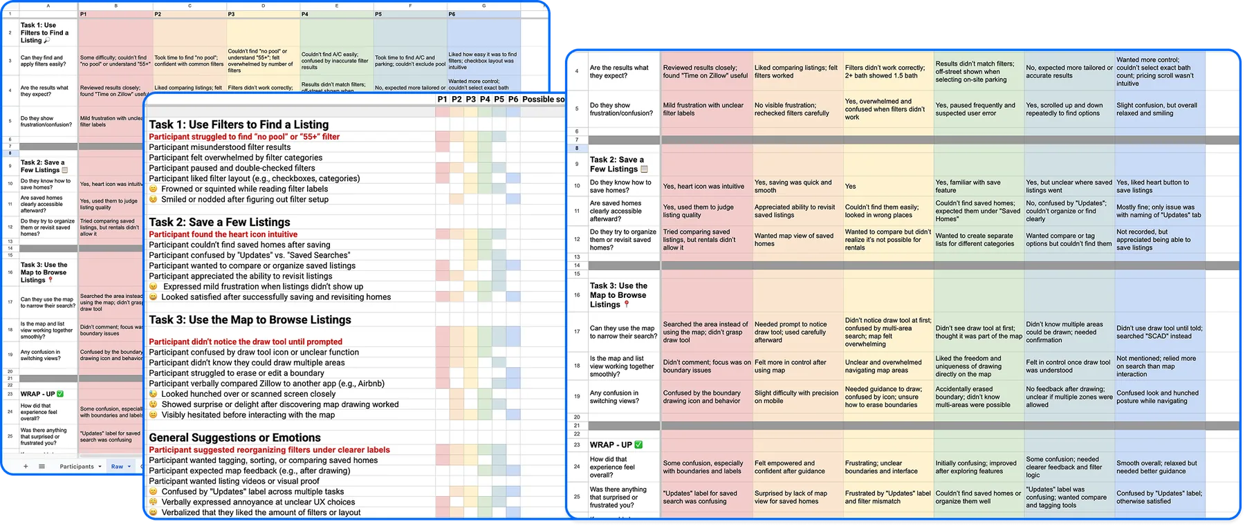
Moderated sessions covered search behaviour, filter use and saving listings, and surfaced clear pain points in navigation, filter labels and saved searches.
View Test Script (PDF, opens in a new tab)-
Task 1
Explore listings using the draw tool
- Explore homes only within two neighbourhoods.
- Avoid listings from other areas of Savannah.
-
Task 2
Apply filters to search for listings
- For rent, under $3,500/month
- 3 bedrooms, 2 bathrooms
- On-site parking and A/C
- No pool
-
Task 3
Save searches and homes to review later
- Save the search for new-listing alerts.
- Save at least one home.
- Find the saved search and the saved home again.
Patterns & Trends
- 6/6didn’t notice the draw tool until prompted
- 5/6struggled with filters and suggested reorganising them
- 5/6found the use of icons intuitive
“I thought the first boundary would disappear if I drew another one.”
“‘Updates’ sounds like notifications, not saved searches.”
“The map feels kind of daunting… I don’t know Savannah well.”
“The filters don’t feel accurate, this one says 2+ baths but it shows 1.5.”
61.0
System Usability Score from participants
175
qualitative data points
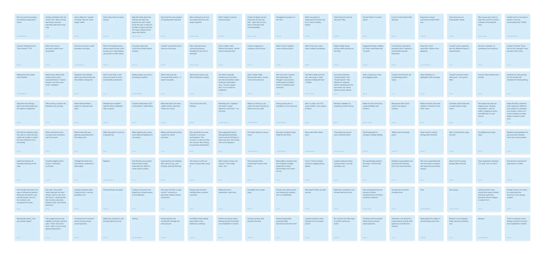
From Chaos to Clarity
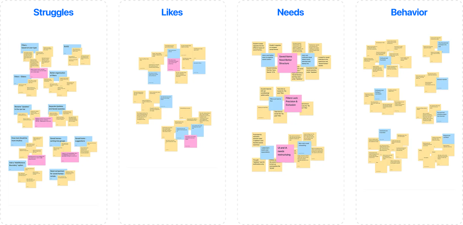
We grouped all 175 notes into four themes, Struggles, Likes, Needs and Behaviours, to find recurring patterns, prioritise issues and turn raw feedback into design opportunities.
Key Insights
- Users struggle to find and manage saved homes vs. saved searches.
- Key filters are hard to find, and exclusion options are missing.
- Terms like “Updates” mislead users and disrupt flow.
- Inconsistent layout causes confusion and extra navigation.
Problem Areas
- Saved Items Are Disorganized
- Filters Are Hard to Find and Inflexible
- Navigation Labels Are Confusing
- Information Architecture Is Inconsistent
How Might We…
Redesign Zillow’s saved items, filters, and navigation structure to help users easily find, organize, and control their home search experience?
Turning Pain Points into Possibilities
- 1
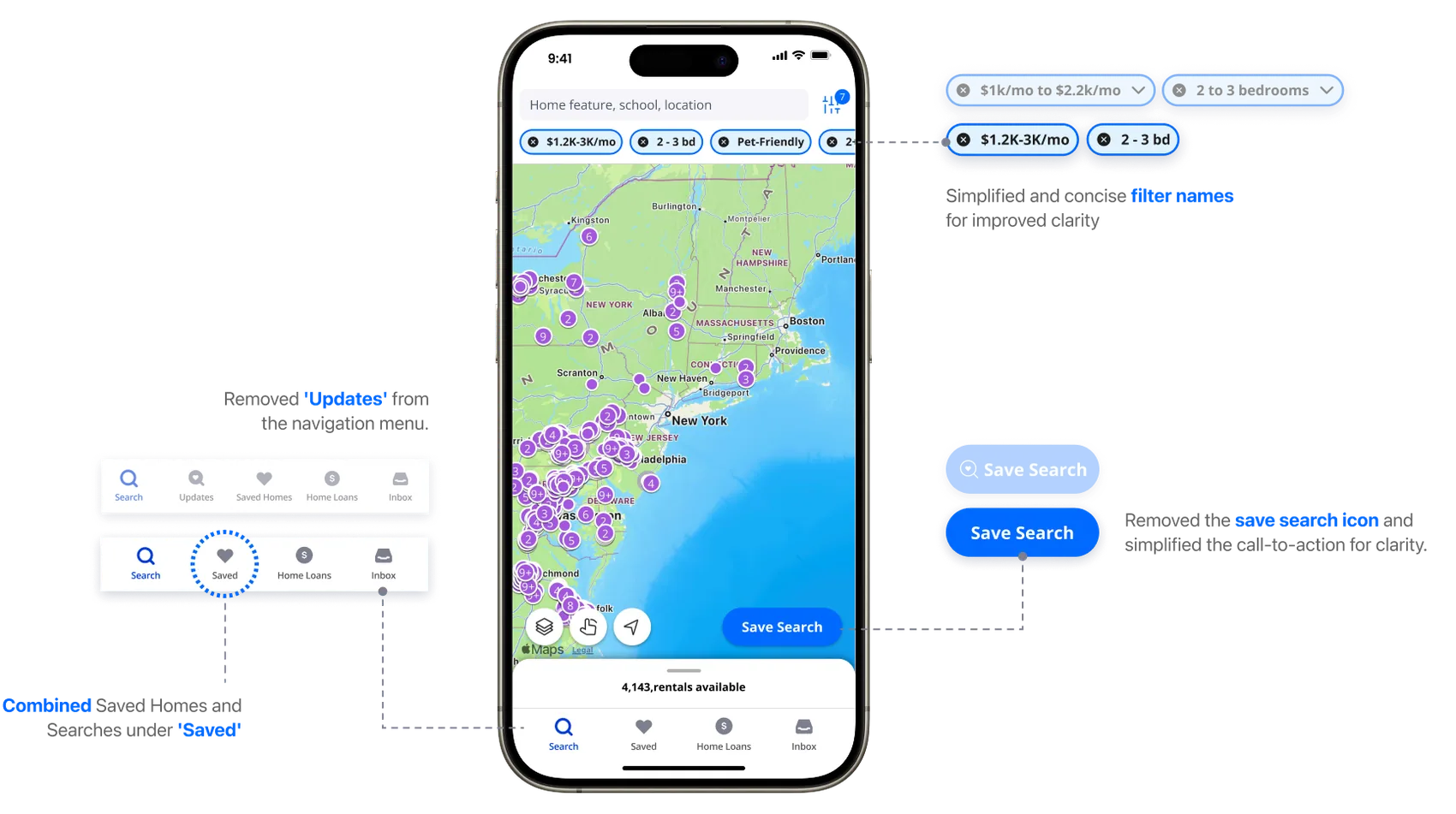
Rethink Navigation Labels
Rename and restructure misleading tabs.
- 2
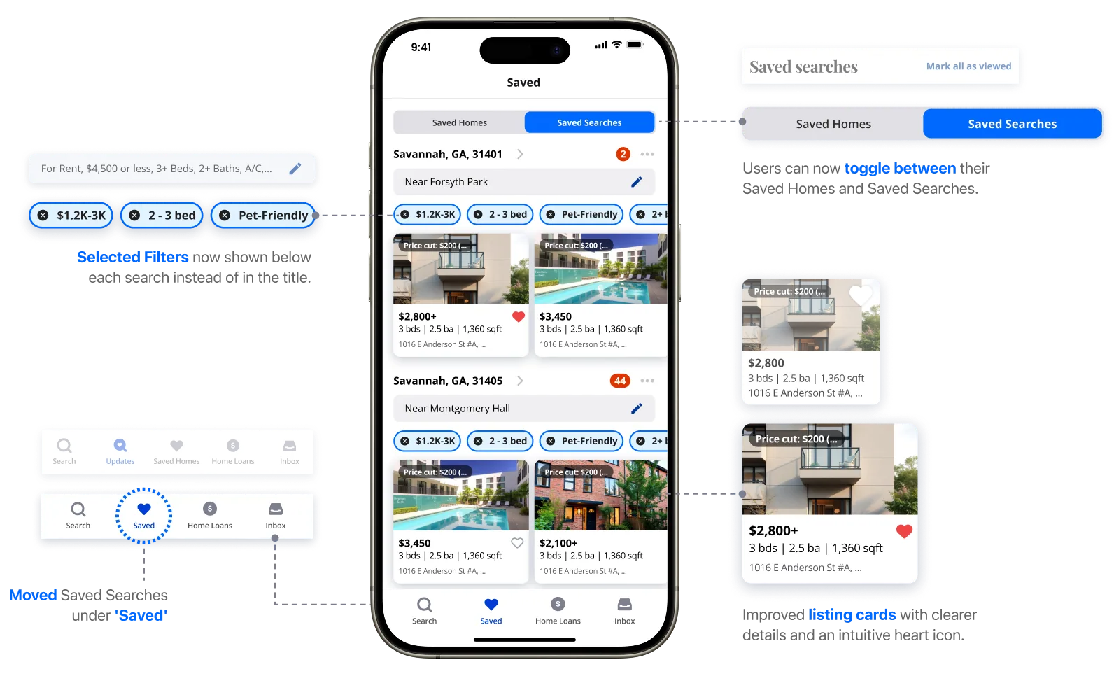
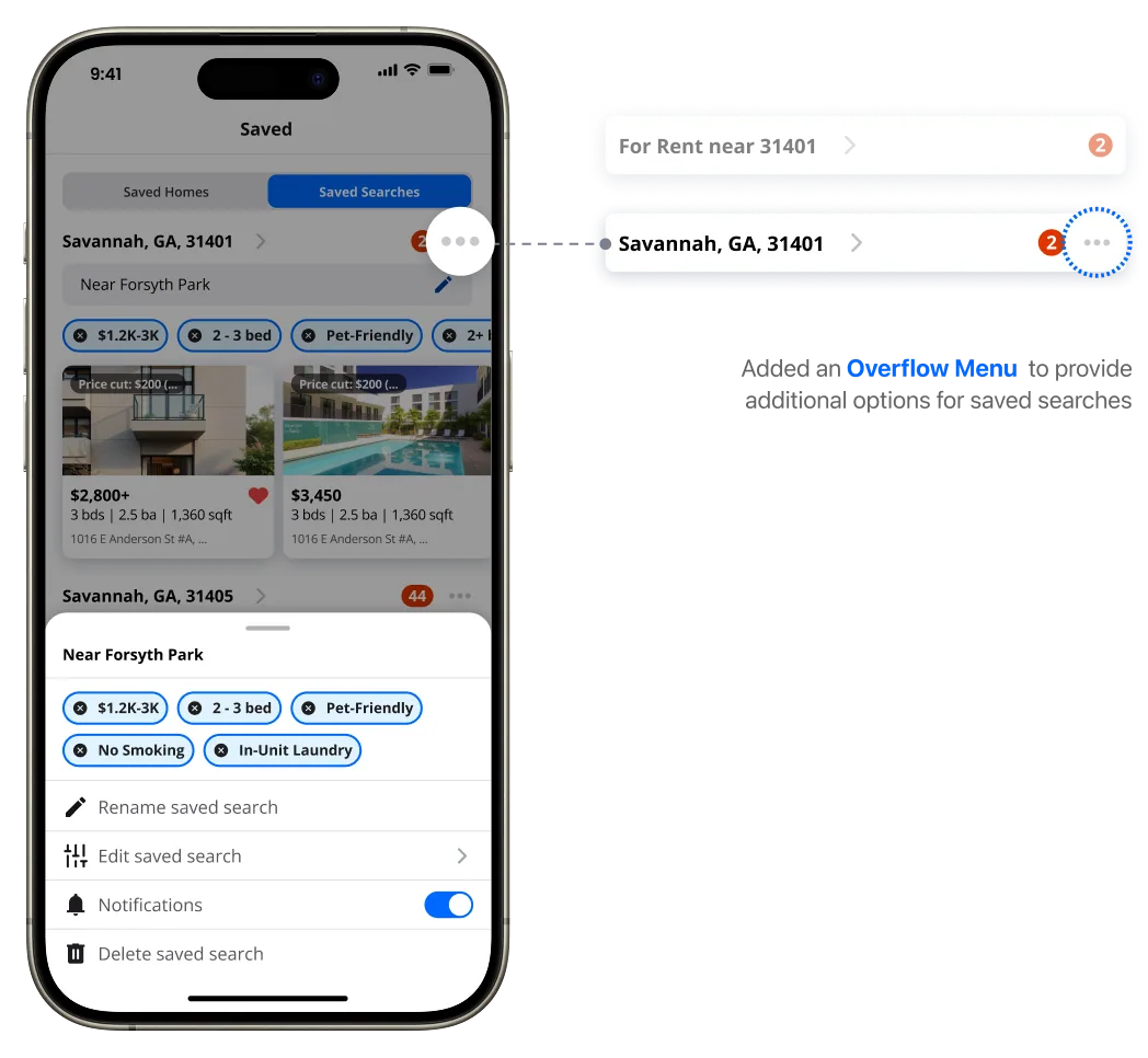
Redesign the Saved Items System
Make saved homes and searches visual and organised.
- 3
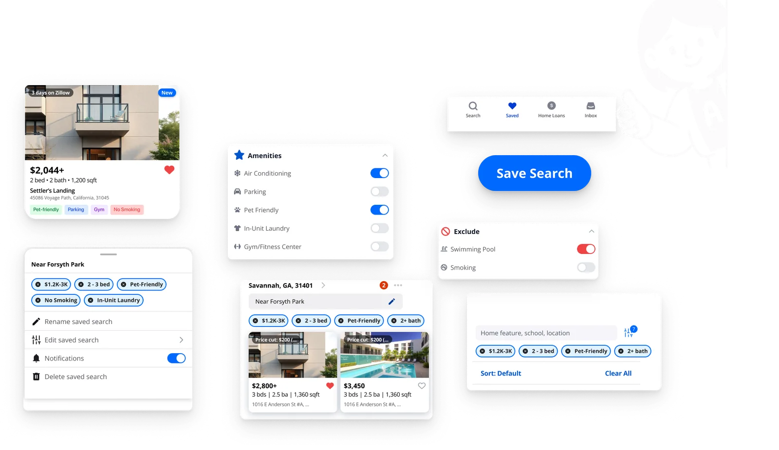
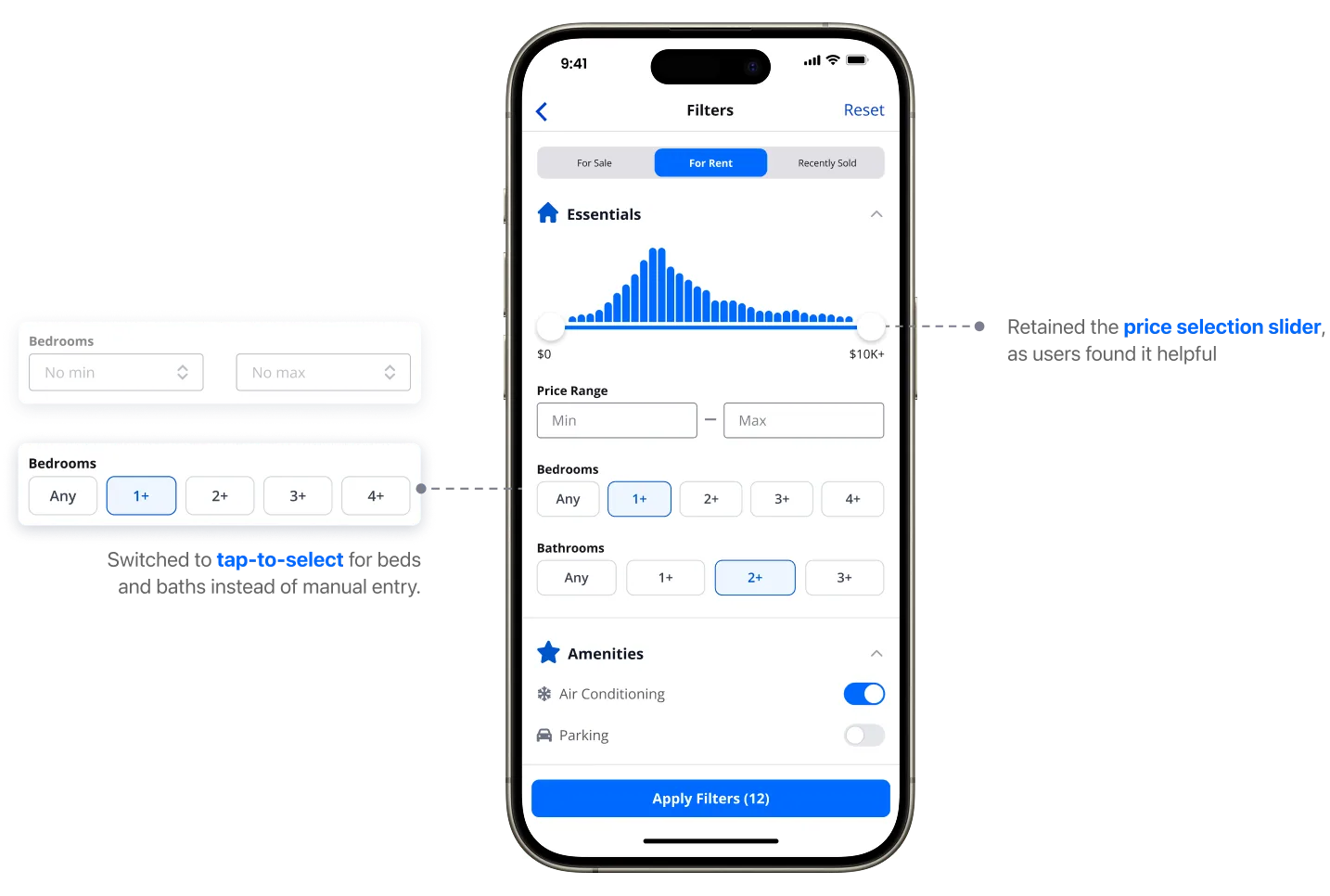
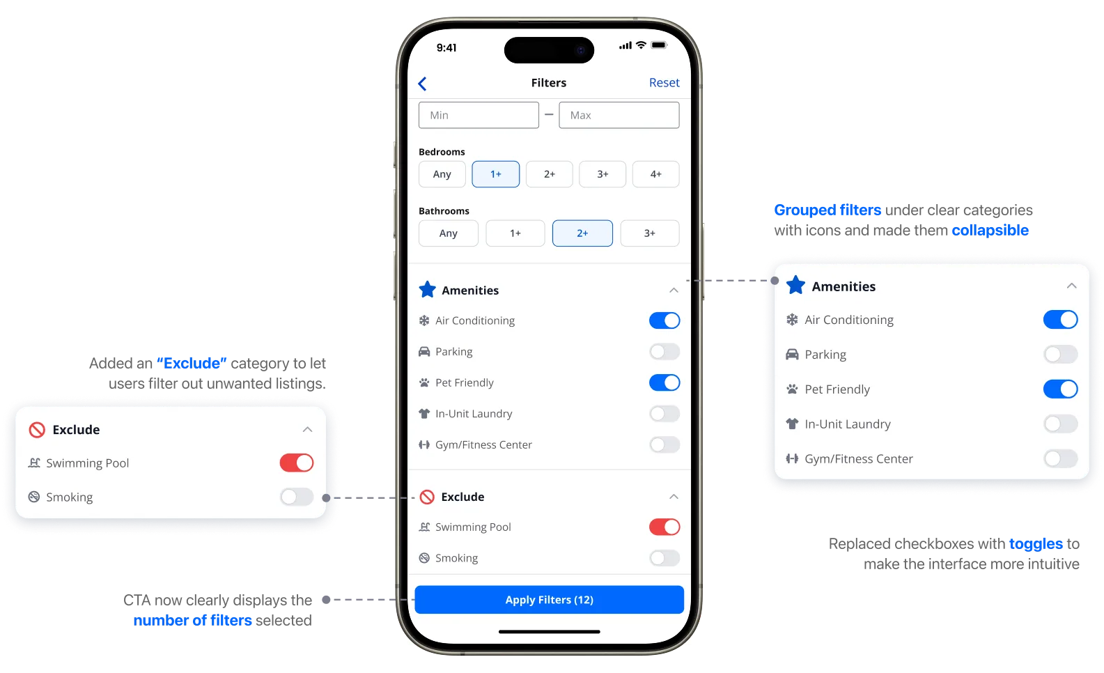
Revamp Filters
Simplify the filter UI and add exclusion options.
Solution 1
Rethink Navigation Labels
Solution 2
Redesign the Saved Items System
Solution 3
Revamp Filters for Organization & Discoverability
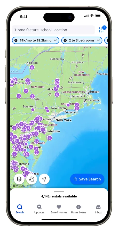
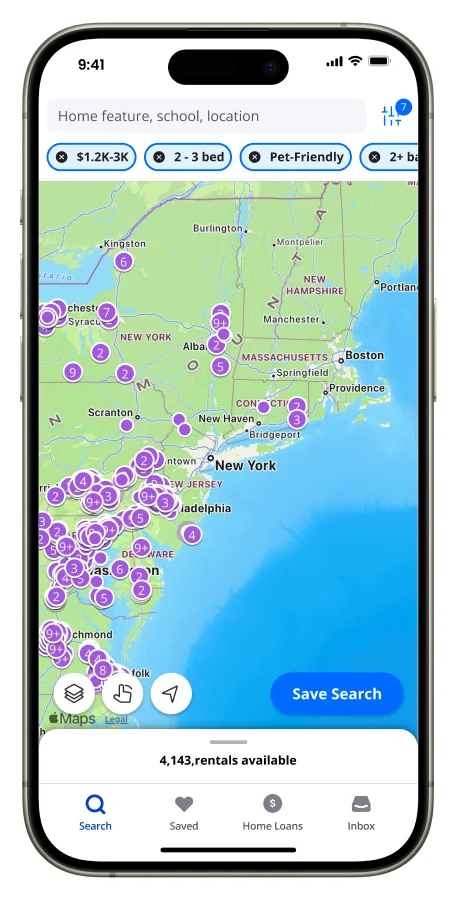
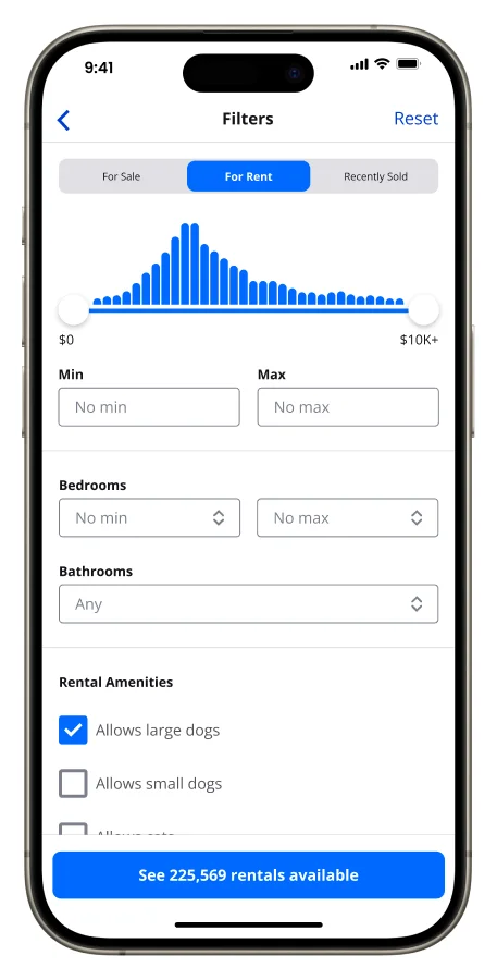
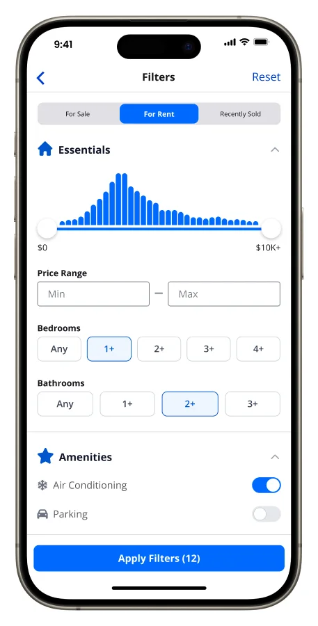
Before & After
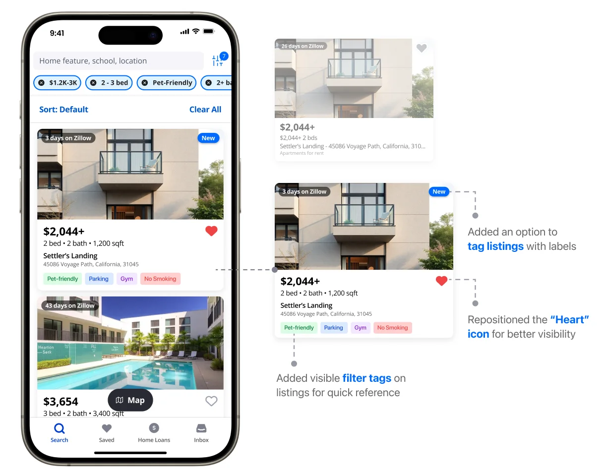
Drag each slider to compare Zillow’s current screens with our redesign.
Impact
The redesign delivered measurable improvements in usability, clarity, and efficiency.
+ Navigation Clarity
Clearer labels such as “Saved” minimized misclicks and hesitation.
+ Task Efficiency
Real-time tag previews and organized filters sped up search completion.
– Cognitive Load
Collapsible filter sections enhanced scannability and reduced the need for excessive scrolling.
– Errors
Simplified flows reduced back-and-forth actions and confusion around saved searches.
Business Model for a Smarter Rental Journey
Our Business Model Canvas focuses on Zillow’s mobile rental platform, a key segment of its wider real estate ecosystem.
Key Partnerships
- Landlords and property managers
- MLS and rental feed partners
- Movers, utilities, furnishing brands
- App store optimisation partners
Key Activities
- Ongoing research and usability testing
- App UI/UX development
- Rental data feeds and listing accuracy
- Personalised notifications
Key Resources
- Rental listings database
- Mobile UX and design team
- Search behaviour analytics
- Brand credibility
Value Propositions
- Clear filters with exclusion options
- Organised saved searches and homes
- Mobile-first browsing, filtering and saving
- Personalised alerts for new listings
- Map discovery with custom boundaries
Customer Relationships
- Alerts that match saved searches
- Quick access to saved items
- Confidence through clear filters
- Self-service with smart defaults
Channels
- Zillow mobile app (iOS & Android)
- Push notifications
- In-app tips for first-time users
- Zillow.com and social ads
Customer Segments
- Young adult renters (18–35)
- Student renters, like SCAD students
- Budget-conscious renters
- Pet owners
- Relocators to new cities
Cost Structure
- App development and maintenance
- Cloud infrastructure for listings
- User research and testing
- Support, moderation and marketing
Revenue Streams
- Featured listings from landlords
- Ads in rental search results
- Partnerships with movers, furnishing apps and renter’s insurance
What Does the Future Hold?

Improve the Map Draw Tool
for more precision and easier boundaries.

Compare Saved Homes
side by side, for better decisions.

Onboarding & Contextual Help
to guide first-time users.
Cross-device testing
How does behaviour differ between mobile and desktop? Are some frustrations specific to mobile UI patterns?
Accessibility & visual clarity audits
Testing against accessibility guidelines (contrast, font size, tap targets) to make the experience inclusive.
The Client Magazine
We packaged the whole study into a 32-page magazine for the client. Flip through it.

Front cover
Conclusion
Our redesign refined Zillow’s mobile rental experience by making navigation more intuitive, filters easier to use, and saved content more accessible. By aligning the interface with real user behaviours, we reduced friction, boosted task efficiency, and increased user confidence throughout the search journey.
Detailed Documents (Google Drive, opens in a new tab)